 For something that did not even register on my radar a month ago, the concept of mobile-friendly websites has grabbed a lot of space on this blog in the young 2016. The first post of the new year led to me realizing that mobile devices should not simply be ignored. The second post discussed a little of what I had learned and described the first steps taken to be mobile-friendly. And this, the fourth post of the new year, is a report on reaching a milestone on the road to mobile friendliness.
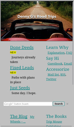
 The milestone I speak of is having a home page that passes both Google and Bing mobile friendliness tests. That’s it at the top of the article in desktop (actually laptop) view and at the left in smartphone view. It is the biggest change to the website’s front door in at least fifteen years. It retains most of the flavor and function of the previous version but is simpler and scales down a lot better. About the only things missing are the RSS feeds from Route 66 News, Roadside America, and American Road Magazine and the randomly selected road trip photo and link at the page’s upper right. Both came with a lot of overhead and I don’t recall anyone ever complimenting me on either. I personally really liked the random picture thing, however, and have kept it alive with a “Done Deeds”-“All Trips”-“Random” menu item. The Google ads also seem to be fairly high in overhead and, although I’m hanging on to them for the present, I will be keeping an eye on them and they could go missing.
The new home page and a revised FAQ page went live just ahead of this blog post. The FAQ page explains that the individual day pages for all ten of the “Decent” (personal favorite) road trips have been updated as have the individual day pages for all trips taken since the start of 2008. The cover pages for all road trips were updated in advance of the January 10 2016 on the Small Screen post. The remaining day pages will be updated in reverse chronological order and will hopefully be taken care of in the next couple of months.
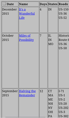
 There are a few pages that may never be truly mobile-friendly as Google and Bing see things. Among these are both Oddment and Road Trip index pages. While changes have been made to make text on the pages readable on mobile devices, the table displays overflow smartphone screens in all directions and require zooming and/or panning to view. There are schemes, using pop-ups and such, to make tables slimmer and more mobile-friendly. I don’t really like any I’ve seen and am firmly of the belief that the conversion effort would not be justified for either of these tables. While they might not be officially mobile-friendly, and I have no quibbles with either Google’s or Bing’s criteria, they seem quite usable on my smartphone and I don’t consider them overly unfriendly.
 The Clickable Collage is another page which is not officially mobile-friendly. Containing a single photo from every completed road trip, it allows the individual photos to be clicked to access the journal for the associated trip. It was formerly available through a link below the randomly selected photo at the home page’s upper right. It is now reached through the “Done Deeds”-“All Trips”-“Collage” menu item. Although I don’t expect everyone to experience the same memory stimulation I do when viewing the collage, I have to believe that it is most impactful when seen in its entirety. Of course this is best done on a full size (whatever that is) screen where the total view is also actually usable. Making this collage fit a small screen by forcing it into one or two very tall columns just seems wrong and more irritating than impressive. It is clearly not a natural fit for smartphone screens but it can, like those index pages, be viewed and used by panning. It can also be zoomed to fit but, while this view of the full collage might have a little of the impressiveness of the big screen version, the tiny pictures are neither clear or tappable unless you have eagle eyes and pencil-point fingers.
All Oddment pages contain a table of photo thumbnails and most of these tables are too wide to fit a smartphone screen without zooming. Modifications have been made so that text on the pages is readable but the tables remain a problem with no ready solution. The most recent Oddment was published in December 2012 and no more are anticipated. Like the index and collage pages, Oddments are not totally unusable on mobile devices but they are undeniably not mobile-friendly. It is possible that some future development or insight will allow them to be made officially mobile-friendly but no such changes are currently planned.
I believe that this blog can now return to regular programming. The remaining daily journal pages will eventually be coerced into friendliness and there might be a few mobile device oriented tweaks as time goes by but I think I’m done talking about it. I just want to be friendly — and mobile.
ADDENDUM 25-Feb-2016: All planned mobile related edits have been completed. I will continue to monitor Google and Bling mobile friendliness reports and respond as appropriate to any issues they identify.

Wow, this responsive design stuff has really gotten under your skin! I’ve GOT to do my main Web site. I’ve done the homepage with that oneliner you gave me and it sort of works but I’ve got all those road trips to do. aieeeeeee.
Whether it actually leads to more search hits is yet to be determined. It certainly hasn’t yet but that’s not the sort of thing that happens overnight (unless you’re Google and you want it to). But it’s probably the right thing to do and I’m benefiting from it personally. I sometimes go to my own website via phone for help in remembering where THAT diner is or when I stayed in THAT motel. Being able to read the answer is a nice change. I had long wondered why one paragraph would be readable while the next was microscopic. Now I know.