 Sometimes hordes of fans demand an e-book version of a publication which prompts the publisher to pull out all the stops and produce one immediately. Sometimes one or two people casually ask about an e-book version and probably forget about it by the time one appears a year or so later. One of these sentences describes my situation perfectly.
It’s not too tough, of course, to figure out which one. It was just a little over a year ago that By Mopar to the Golden Gate was published as a paperback. I was immediately and understandably asked if an electronic version was or would be available and I had my answer ready. Nope, I said. It was too much work. I suspect those who asked were as surprised by my answer as I had been surprised to learn that making a document completely comprised of digital computer files available to electronic readers wasn’t simply a matter of checking a box and clicking a button. After all, I had published through Amazon and anyone somewhat familiar with their collection of services might be more inclined to believe that than those knowing nothing at all about them. The Kindle side of Amazon’s website clearly states “Publishing takes less than 5 minutes and your book appears on Kindle stores worldwide within 24-48 hours.” That’s not a lie. It’s just not the whole story.
Kindle Direct Publishing (KDP) is Amazon’s e-book publishing component. There really is a button that will transfer a book produced through Create Space, Amazon’s hard copy publishing arm, to KDP in “less than five minutes” and I don’t doubt in the slightest that it would be “on Kindle stores worldwide within 24-48 hours”. It will even be readable if — and here’s the rub — it is formless and free flowing. Most are. Most, in fact, are 100% text. Fiction, they say, is what drives e-book sales. If, on the other hand, your book has, say, 160 or so carefully sized and positioned photographs, it’s a different story.
This topic came up recently in an e-versation with a couple of friends heading down the self publishing trail. The discussion benefited from some expert insight that reinforced the fact that, for certain books, there is no single box to check or magic button to click. And it prompted me to revisit the issues I’d ran away from a year ago, work through them, and produce an electronic version of By Mopar to the Golden Gate.
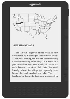
The central issue — it can’t really be called a problem — is the variety and flexibility of e-readers. Content designed for a specific sized sheet of paper just doesn’t get along well with all the different hardware variations and the ability of users to customize things like font style and size. Publisher types talk about two styles of e-books, reflowable and fixed layout, both of which are pretty much described by their names. Reflowable documents make few or no assumptions about the devices used to display them. When a bigger screen is available, more of the document is displayed on each “page”. If the user selects a larger font, less is displayed at one time but the entire document will ultimately flow across the screen if the user just keeps scrolling. That’s different than with a fixed layout document. It may be possible to zoom the display so that characters are larger and more readable but zooming magnifies a portion of the “page” and other portions may never be seen by scrolling. If you’ve ever used an e-reader for something digitized by capturing an image of each page, you’ll immediately understand. Reading a zoomed fixed layout document can sometimes seem like reading a billboard with a jeweler’s loupe.
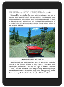
 Other than correcting a couple of spelling errors, absolutely no text was changed in generating the e-book. The same pictures are in the e-book as in the paperback with essentially the same dimensions. I did utilize color versions so they ought to look a little prettier on some devices. To make things reflowable, I unhooked the pictures and their captions from fixed positions on the pages and placed them between paragraphs. If you think of the sizing and positioning of a book’s non-text elements within the text as design, then what I did was undesign the book. To be honest, there wasn’t very much “design” in it. I placed pictures where I thought they looked good and I chose sizes to spotlight those I particularly liked or to allow some to be grouped together. Design is too kind a word. At best what I did was layout. I arranged some block images so that they looked alright, appeared near any text that referenced them, and didn’t disrupt that text too much. But other books truly are designed and their designers agonize over scaling and placing elements so that a page — a physical page with fixed dimensions — looks good and works well. That sort of design is no better accommodated in the e-reader world than my clunky picture layouts.
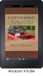
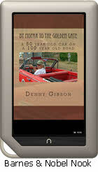
At present, the electronic version of By Mopar to the Golden Gate is available for Kindle through Amazon and Nook through Barnes & Noble. Whether it ever goes to other platforms or distribution channels is undecided. It’s my impression that software supporting one or both of these formats is available for most devices. At Amazon, By Mopar to the Golden Gate is part of the MatchBook program which means that all past and future purchasers of the print version can get the Kindle version for just $1.99. I haven’t yet figured out how to provide Kindle versions on the cheap to those who purchase the book elsewhere but I’m working on it. Click on the images below to go shopping.


Wow, the book, now this.!!
Some would call it recycling.
“Reading a billboard with a jeweler’s loupe.” Great line. I’ll tuck that away for another day; I might need it.
I think that’s called recycling, too. And it’s all good.
On my way to Amazon.com right now.
Thanks, Bill. Hope you enjoy it.