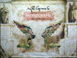
 I don’t know if we are entering an era of fine art circuses or if they are merely a passing fad. Apparently Michelangelo’s Sistine Chapel: The Exhibition has been in circulation since 2015. My impression is that the various immersive Van Gogh shows (I recently saw this one.) date to 2020 or so but I’m not certain. Those dates make me think that the current popularity of the Sistine Chapel thing might be fallout from the popularity of the Van Gogh things but I am not, of course, certain of that either. What I am certain of is that I didn’t hear of either before late 2021 and the hoopla surrounding one made me receptive to the hoopla surrounding the other.
 One characteristic the two exhibitions have in common is physical size. Lots of space is needed to either immerse people in wall-sized projections or surround them with ceiling-sized prints. The Sistine Chapel exhibition in Dayton occupies one floor of a former Elder-Beerman department store. Not knowing the location of the now unmarked store within the mall meant driving around until I spotted a sign-covered entrance.
 It was a bit before the stated opening time and that entrance was locked. Several people moved on when they discovered this but I and a few others waited. Timed tickets came with instructions to arrive at least ten minutes ahead of the scheduled entrance, and the doors were unlocked with almost enough time to make good on that. Three women entered ahead of me. As we got our tickets scanned, a group approached from inside the building. I’m guessing these were people familiar with the mall and aware of another entrance to the store that may or may not have been open earlier but which clearly required a walk to the exhibition entrance. One of the ladies in front of me opted to watch a video before entering and the others paused at the gift shop. I entered the exhibit first and alone.
I have seen photos taken of Sistine Chapel exhibits in other cities where some of the prints are displayed overhead to simulate, I presume, the ceiling of the real chapel. Thankfully that wasn’t the case here as that would at least partially nullify the “up close” claim of exhibit promotions.
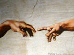
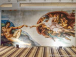
 There’s no question that the most familiar image from the chapel frescoes is of God’s finger bestowing life to Adam. That detail is from The Creation of Adam which is placed very near the entrance. I’ve seen plenty of reproductions of this scene but I guess I have always focused on the hands or maybe the faces of God and Adam. Before today I’d never noticed the young lady on the right with wide-open eyes aimed directly at Adam.
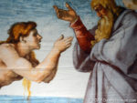
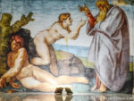 I was completely unfamiliar with the majority of images displayed and that includes, perhaps surprisingly, The Creation of Eve. I don’t recall ever seeing a reproduction of this image before. I may have missed one here or there but it certainly hasn’t been given a whole lot of attention by the world at large. Michelangelo thought it was important enough to put it in the very center of the Sistine Chapel ceiling. There is a placard by each print that gives some information about the image and shows its position at the chapel. The one for The Creation of Eve is here. A clearer view of the ceiling, taken from a poster in a window at the entrance, is here.
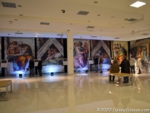 The Creation of Adam and The Creation of Eve are visible from the main room but are set back a bit. I had actually viewed every picture in that entire room, with very little company, between viewing Adam and then Eve. Behind me, the steadily increasing crowd was doing the same.
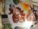
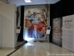
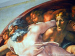
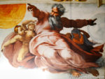 Almost nothing in the main room was familiar to me. The same was true of the prints in the area beyond Eve — with one exception. This image of God with arms extended is one I’ve seen several times. In fact, it and the almost touching hands from The Creation of Adam were both used in promotional materials for this exhibit. However, I really knew nothing about it and my previous interpretation was completely wrong. I’d thought God looked pretty angry in the painting and assumed he was telling someone to get off his lawn or out of his garden. The Creation of the Sun, Moon, and Plants contains two images of God. His expression in the righthand image is not one of anger but an indication of the force being used. The lefthand image is of a true “dark side of the moon” moment with God turned away from the viewer as he creates Earth’s vegetation.
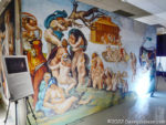
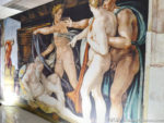 Once I’d passed by all the prints, I sat down to watch that video I’d skipped on the way in. It was not tied directly to the exhibit but was primarily comprised of PBS programming on Michelangelo. One of the things I learned from the video was that, in exchange for carving a crucifix for the Church of Santo Spirito, he was allowed to study corpses awaiting burial at the church. The Deluge and The Drunkenness of Noah are just two examples of how he made use of the knowledge of anatomy gained there.
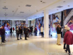
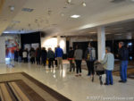 A fair-sized line existed when I started watching the video but it was pretty much gone by the time it had cycled through. The video mentioned The Last Judgement and reminded me that I had seen it mentioned in exhibition ads but had not seen it at the exhibition itself. Michelangelo painted The Last Judgement at the Sistine Chapel altar twenty-five years after he had painted the ceiling. Thinking I might have somehow missed it, I stepped back inside to take another look. No luck, and I was eventually told that it was “lost at the airport”. The exhibition images are described as “life-sized” and a picture on the exhibition website makes it look like that includes The Last Judgement. As we’re often reminded, “Many Bags Look Alike” so maybe someone accidentally walked off with the wrong 40′ by 45′ suitcase.
I have seen comments online about the exhibit being unrefined and knocking the lighting in particular. Those comments are, in my opinion, accurate. The prints are not displayed and lighted as would be expected in a good art museum. There are actually some similarities, starting with the fact that it’s set up in an abandoned store, between the exhibit and those “starving artists” sales that used to pop up in furniture outlets and such. The process that accurately transferred the images from the curved ceiling to large flat panels is remarkable and the prints are quite impressive but, at the end of the day, they really are just printed versions of paintings.
There is certainly no possibility that the defunct Ohio department store will be mistaken for a five-century old Italian chapel. But there is a very real possibility that attendees will get a sense of the magnitude of Michelangelo’s accomplishment that just isn’t there when looking at normal-sized reproductions of the artwork. The images are big and there’s a lot of them. Yes, the exhibition is a circus and its staging leaves plenty to be desired but I came away with a pretty good appreciation for the six thousand square foot (plus 1800 sq. ft. Last Lost Judgement) masterpiece without crossing the Atlantic. And I got a much better look at the details than I could ever get craning my neck to peer at images nearly forty feet above my head.
