In my unprofessional and biased opinion, this book represents what Jim Grey does best. I believe it is his fifth book. It is the fourth that I’ve reviewed. Although I enjoyed reading the collection of essays entitled “A Place to Start” when I sat down to write a review I just couldn’t figure out what to say. I did review Grey’s most recent offering, “Vinyl Village“, and deemed it a success in accomplishing its mission. That mission was to tell the story of a subdivision in pictures. I noted in that review what I thought was one of the biggest differences between “Vinyl Village” and the two earlier books, “Exceptional Ordinary” and “Textures of Ireland“. Each photograph in the first two books could be appreciated all by itself; few if any in “Vinyl Village” could stand alone. That’s not a bad thing and it’s not an accident. The goal was to tell a story in pictures and it makes sense that all the pictures are required to tell all of the story. It does, however, serve to explain why I like this and the first two books best. I said up front that my opinion is biased.
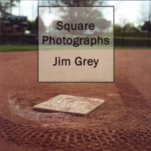
“Square Photographs” contains forty photographs that are capable of standing alone. All were taken with one of two 1960s Yashica twin-lens-reflex cameras in Grey’s collection. These are medium format cameras using 120 film to produce 60 mm by 60 mm negatives. I’m guessing that I don’t really have to explain where the book gets its name. Cameras that produce square images were once fairly common but are quite rare today. Smartphone cameras, the most common of all, typically record images with a 4:3 ratio.

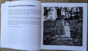
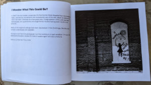
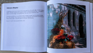
The book is organized so that all photos are on the right-hand page and of a uniform size that essentially fills the square page. Text that varies from a couple of lines to several paragraphs is on the left. It might describe the picture, share some facts about the subject, or share something personal related to the image. The bottom line of text always identifies the camera and film that produced the image. Putting a squarish subject in the center of a photograph yields a pleasing image with a background balanced both vertically and horizontally. “Square Photographs” contains several such images.

Of course, not every subject is square or even symmetric. Composition techniques different than those used for rectangular photos can come into play. As Grey explains in the brief introduction, the 1:1 ratio is familiar to him from some of the cameras of his youth but for the rest of us, it might seem a little unusual.

The pictures are almost evenly split between color and B&W. The copy I have is printed using the highest quality paper and ink available from Kindle Direct Publishing (Amazon) and I think it looks great. However, an even higher quality version is available from MagCloud.
“Vinyl Village” was the first photo-centric book that Jim published through Amazon. I thought the quality more than sufficient for the task. Others, apparently, did not. I certainly appreciate the increased image quality of this printing and don’t doubt that the deluxe edition is worth the additional cost but sure don’t see any reason for what I sense are some feelings of guilt associated with “Vinyl Village”. In this book, where the photos are the product, the additional cost is justified. Not so, in my opinion, for B&W pictures illustrating a story.
I first heard of this project when it was still in the planning stages. In the time between then and its recent completion, I’ve realized that, despite the lack of cameras that produce them, square images aren’t as alien to us as I first thought. One example is Facebook’s profile pictures. Another is Instagram which initially supported only square photos. I understand that other form factors are now allowed but I still square my submissions — when I remember. The reason I started doing that was because some software would blindly chop out a square in the very center if I didn’t and that was rarely the best square to be had. I’m sure there are other examples.
I’m used to squaring rectangular pictures. For this blog, thumbnails are simply automatically created scaled-down replicas of the full-size rectangles but for the journal portion of the website, thumbnails are square. It’s something I’ve never mentioned and something I doubt anyone has noticed. If so, they’ve not mentioned it. For the first journal, I extracted odd portions of photos for thumbnails but that was tedious and not well received. I very quickly moved to 72×72 pixel squares which became 100×100 pixel squares by the fifth documented trip and there it remains. Occasionally I’ve thought of adopting automatically shrunken rectangles but the squares allow me to get more of them in a given screen area and producing them is good mental exercise.
The standard edition of “Square Photographs”, like the one I have, can be obtained through the Amazon link at the bottom of this article. Links to both the standard and deluxe editions as well as some additional information can be found here.
Square Photographs, Jim Grey, Midnight Star Press (June 12, 2022), 8.5 x 8.5 inches, 86 pages, ISBN 979-8835769872
Available through Amazon.

Thank you Denny – I appreciate your thoughtful review!
It’s a good book. I hope it does well.