Max is Back

I saw a movie on Thursday. I suppose I could have made this a movie review but I was really more interested in the theater than the movie. Besides, if I used this as a review to be posted on Wednesday, I’d have to resort to some canned article for the regular weekly post.

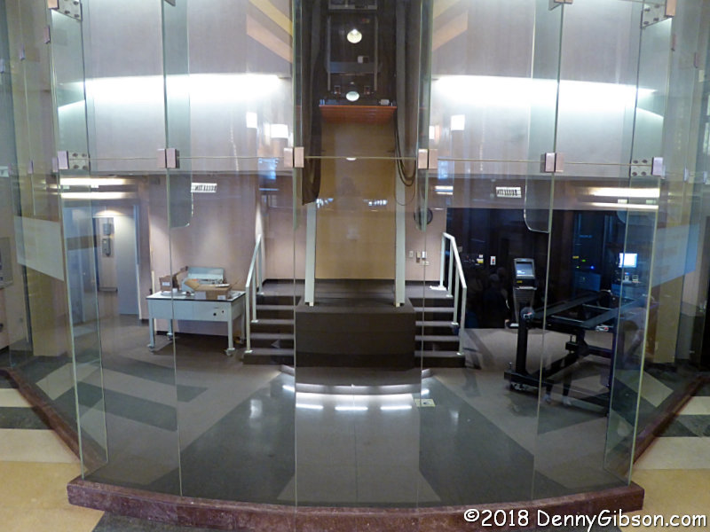
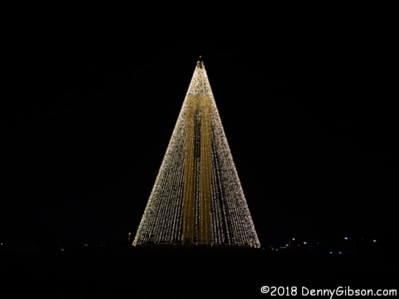
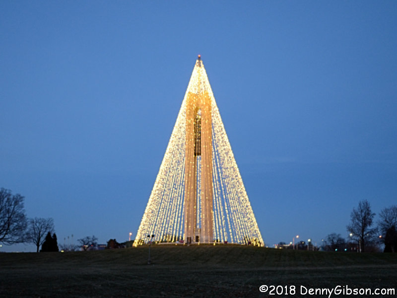
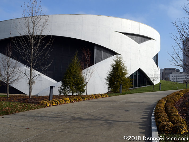
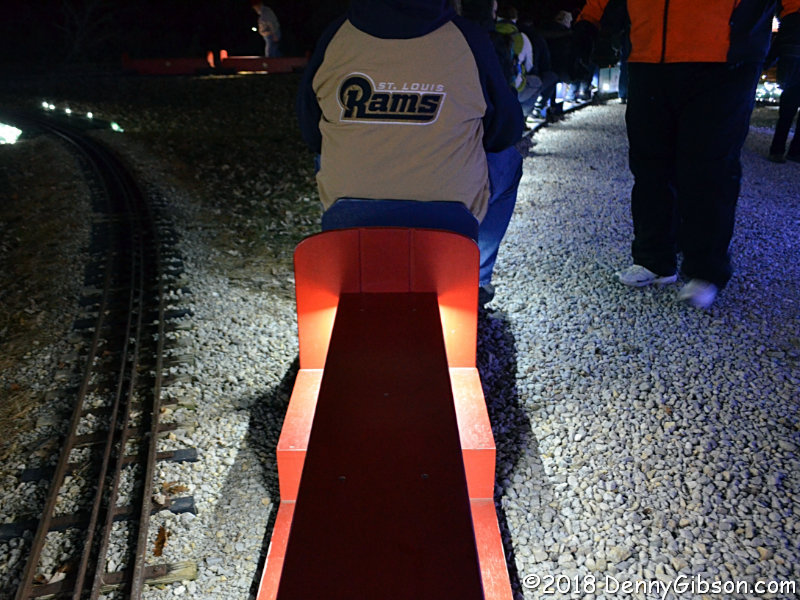
Thursday was the first day the newly renovated Robert D. Lindner Family OMNIMAX® Theater at the Cincinnati Museum Center was open to the public. It was partly luck that put me in the theater for the first showing of Volcanoes: The Fires of Creation and more luck that put me in one of my favorite seats near the projector. The seat was part of the renovation. It was new, a little wider than what it replaced, and quite comfortable. I took no pictures inside the theater. Some can be found online in professional reports. The picture that opens this article is the only one I took of any part of the theater. It’s a room that patrons pass entering and exiting. In the old days, huge rolls of 70 millimeter film laid on tables here to feed the big projector directly overhead. Nowadays the movie is digital and probably stored on something roughly the size of a grain of rice.

Not being certain that I would be in town for the opening, I’d made no plans and was surprised to see that loads of tickets remained for all showings. That produced a deep lack of urgency and I was equally surprised when I approached the museum and found a long line of cars working its way into the parking lots. I later learned from a staff member that it had been like this at the recently reopened Museum Center ever since schools closed down for the holidays. “And the rain helps”, she added.

I instantly realized that I should have committed to a specific time and bought my ticket online but, although the theater doors were opened well before I reached them, I was safely in my seat before the action began. As I entered, it was announced that the showing was sold out but there were still many empty seats when the lights went down. The wider seats have reduced capacity from 245 to 227 but I’m guessing that won’t often be an issue.

With the lights still up, differences in the screen were obvious. The old screen was more porous and the speakers behind it could be seen when nothing was being projected on it; A little staring revealed the seams where panels overlapped. The new screen is a little whiter and less porous; There is no overlapping of panels. Some darkish lines, which I believe are bits of the backing frame, can be detected if you look hard enough. There are still speakers behind the giant screen but now they can only be heard and not seen. They say that the new sound system sounds better and I believe them. It certainly sounds wonderful but so did the old one and a side-by-side comparison just isn’t possible.

The action on the screen starts, as it has since the theater’s beginning, with the attention gripping light tunnel. There are improvements but they are subtle and they remain subtle into the feature. The images seems crisper and a little brighter. The slightly fuzzy focus and warping that sometimes crept into the edges is virtually gone. I’m guessing that some of that is due to the theater, and some is due to the camera and recording technology. The movie begins with an animation of Earth’s collision with the planet Theia some 4.5 billion years ago. The images are sharp and crisp. They seem just as sharp and crisp when the scene changes to humans backed by a lake of lava. Although I know that the second scene came through a camera’s lens, that knowledge doesn’t prevent part of me musing about whether the lake is real or a man-made special effect. No doubt, the conditioning that comes from seeing action movies with similar scenes produced by CGI is partly to blame but it’s also a testament to just how good the “real” scene looks.

Most of the improvements are a matter of perception. One is an indisputable fact. The floaters are gone. No matter how hard theater operators tried, it was impossible to keep those over-sized rolls of film entirely dust free. Specks of dust would occasionally appear on the screen like floaters in your eye; Not with digital.

Using Volcanoes to reopen the theater was a good choice. According to the movie’s website this is the tenth theater to show it. A fair amount of science is mixed in with the dramatic visuals. Those visuals include lava lakes, billowing plumes of smoke and ash, startling eruptions, scenic landscapes, and even some animals such as elephants and giraffes on the plains of Africa. There is considerable footage of the recent lava flows in Hawaii. I found the shots of eruptions particularly impressive. Incredible power is very much in evidence here. Dark spots in the smoke and flame can appear to be floating upward like scraps of burning paper at a camp fire, but when they stop their climb and plummet downward it quickly becomes apparent that they are massive boulders tossed into the air by the volcano’s explosive force. Sometimes the recording equipment is close enough capture the thud of their landing.

A schedule for future movies at CMC has not yet been worked out. In fact, I found no information on when Volcanoes’ run here will end. Plans exist for the return of the popular Weekend Classic series In January. That will most likely start with a digital version of National Park Adventure which was the last movie to play here in the old analog days. My review includes a shot of the room at the top of this article when it was filled with gear and those big rolls of film.

Trip Peek #77
Trip #13
To & From Two Johns

This picture is from my 2003 To & From Two Johns day trip. Even though it was categorized as a day trip and documented on a single page, there were actually two days involved. The first day was spent driving to Indianapolis on back roads. After a night in the city, we headed south to visit Columbus and Madison, Indiana. The reason for the trip and the source of the title was a concert featuring Johnny A and John Hiatt. That’s Johnny A in the picture.


Trip Peeks are short articles published when my world is too busy or too boring for a current events piece to be completed in time for the Sunday posting. In addition to a photo thumbnail from a completed road trip, each Peek includes a brief description of that photo plus links to the full sized photo and the associated trip journal.

Got the Hanger Before the Plane

The title is my questionable attempt to make an aeronautical version of that saying about getting the cart before the horse. I started on a trip yesterday that is aimed at having me at Kitty Hawk, North Carolina, for the 115th anniversary of the Wright brother’s first flight on Monday. In anticipation of that, I recently revisited some Wright related sites in nearby Dayton, Ohio. This was actually the main reason I was in Dayton when I made the Carillon Historical Park visit that yielded last week’s Christmas themed post. There’s been a bit of a squabble between Ohio and North Carolina over where this flying business got started, but my title is not a reference to that. I’m just acknowledging the fact that this blog post about the Wright brothers in Dayton is going up before my trip journal entries about the brothers in North Carolina. Dayton was the Wright brothers’ home and there are quite a few locations associated with them. Probably the most important single location tied to the Wrights and their development of human flight is Huffman Prairie Flying Field where a replica of their 1905 airplane hangar stands. A placard in the hangar is here.

Official input to the squabble included North Carolina putting “First in Flight” on their license plates in 1982 and Ohio following with “Birthplace of Aviation” in 1997. In theory, the argument officially came to an end in 2003 when the U.S. Congress recognized Ohio as “the birthplace of aviation” while acknowledging that the first flights occurred in North Carolina. The text associated with that recognition is here. It’s easy and maybe somewhat natural to think that Ohio got the nod because the Wrights lived there but that the actual “birthing” happened in NC. The fact is that the brothers did a lot more than live in Ohio. Tremendous amounts of research and experimentation occurred in Dayton both before and after the trips to NC, and almost all of it that took place after December 17, 1903, took place at this field near what is now Wright-Patterson Air Force Base. Both of those slogans are correct. The first flight — actually the first four flights — happened in Kitty Hawk, North Carolina; Aviation was born in Dayton, Ohio.

The reason for the Wrights’ trips to North Carolina was the strong and steady winds there. They had proven that their machine could fly, but further development was required. The brothers naturally wanted to avoid the time and money consuming trips to the coast but Ohio winds are weak and fickle. They might lay out as much as 240 feet of rail only to be forced to move it when the wind shifted. The catapult near the hangar is a replica of the one they used to shorten takeoff distance to 60 feet with less need for a headwind. The brothers improved on the machine they flew in NC and eventually learned to control the craft to the point of flying around the perimeter of the field. Their flight path is kept mowed and may be walked.

Not far from Huffman Prairie Flying Field, a Wright Brothers Memorial stands atop a hill that bears their name. The area containing the field is included in the view from the overlook behind the monument. There is a small museum and interpretative center across the road from the monument.

What I think is one of the coolest sculptures around stands in the median of Main Street in downtown Dayton. Called “Flyover”, it is a full scale representation of that first flight in Kitty Hawk. The sculpture’s length matches the 120 feet covered by that first flight. Each of the flight’s 12 seconds is marked by a set of wings showing the craft’s climb and descent. It’s really eye-opening to walk the length of the sculpture and realize just how short that first giant hop for mankind was. Another full scale sculpture stand just a few blocks away, on Monument Street. The plane depicted is the 1905 Wright Flyer III in which the Wright brothers improved their design and skills at Huffman Prairie. The real thing shows up in a couple of paragraphs.

The Wright Brothers National Museum is inside Carillon Historical Park. It’s been there since the park opened in 1950 but just received the “National” designation in August. More Wright brothers artifacts are displayed here than anywhere else. The bicycle in the second picture is one of five Wright brand bicycles known to exist and one of two on display in this building. The Wrights eventually built a wind tunnel and other devices for more accurate measurements, but some of their earliest testing involved mounting variously shaped surfaces on the horizontal wheel then peddling into the wind to see how they reacted. This may not be the most famous camera in the world but it is responsible for taking one of the most famous photographs in the world. Orville set up the camera before climbing aboard the flyer, Wilbur handed off the bulb so he could help steady the craft during takeoff,  and John T. Daniels pressed that bulb at the right time to head off the “pictures or it didn’t happen” crowd back in Dayton.

The story of how this display happened is almost as cool as the display itself. In the 1940s, when Colonel Edward Deeds was putting this park together, he had a chat with his good friend Orville Wright about making a replica of the first Wright Flyer. Orville had a better idea. Why not rebuild the real Wright Flyer III? This was the first truly practical flyer and the brothers considered it their most important aircraft. It had served its builders well in their 1905 developments at Huffman Prairie, then had been shipped to Kitty Hawk for U.S. Army trials in 1908. Following the trials it had been more or less abandoned although there were some pieces in various locations around the country. Orville knew where those pieces were and of course he knew everything there was to know about the original plane. What followed has been called “The first pilot’s last project”. Not only did Orville contribute to rebuilding the airplane, it was his idea to display it in a sort of pit so that visitors could get good views of the whole thing. It is believed that approximately 85% of the original machine was recovered and 60% to 80% was used in the reconstruction. Many of the original pieces that were not made part of the plane were used in making replacements. Some of these are displayed nearby. A placard with the plane’s specifications stands by one of its wings. 

Kitty Hawk Holidays

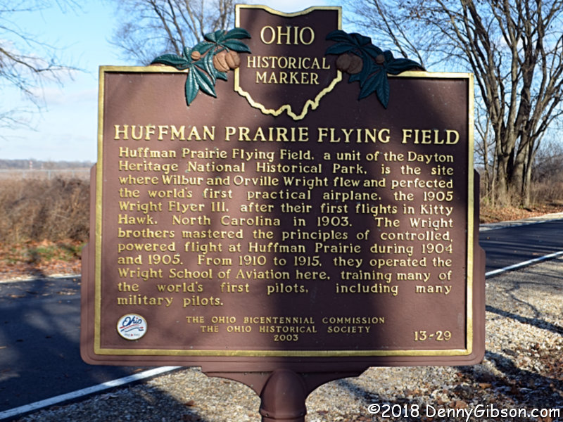
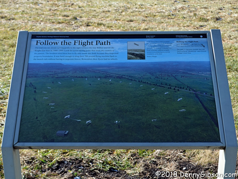
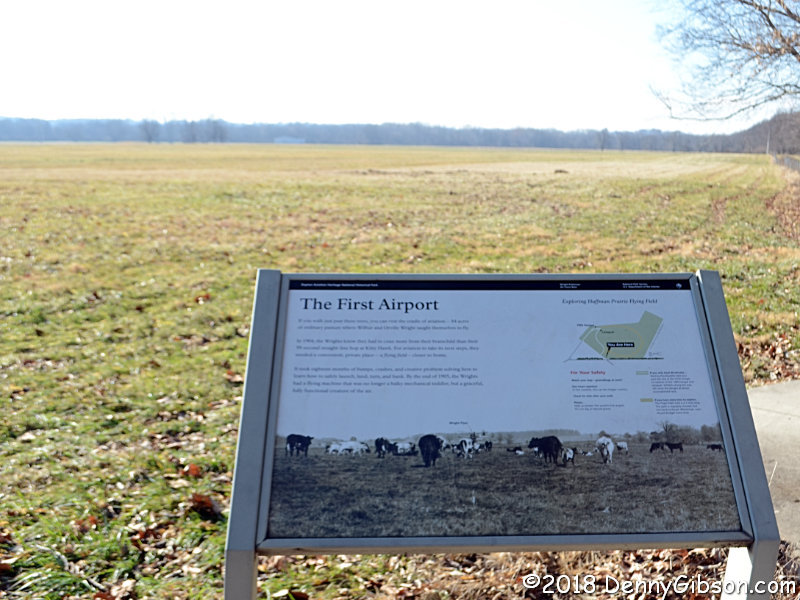
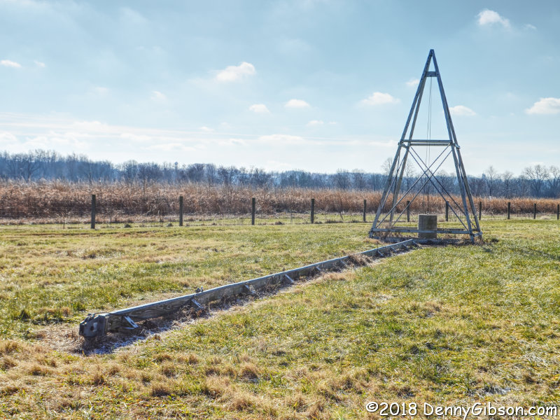
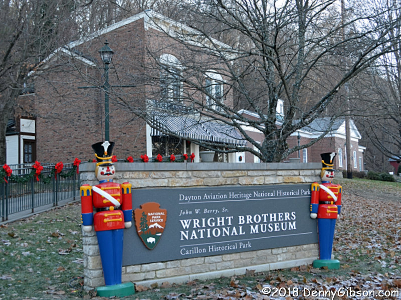
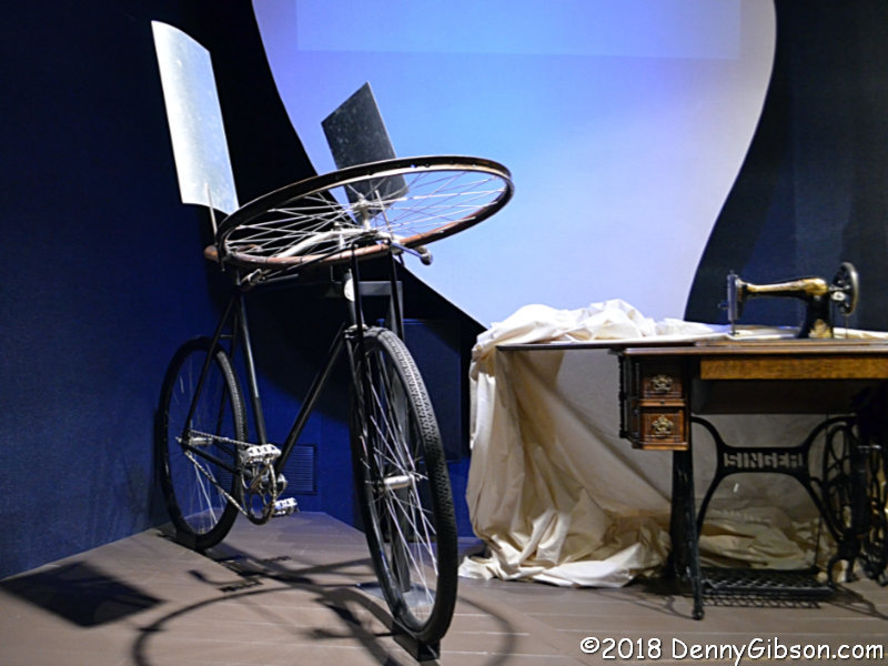
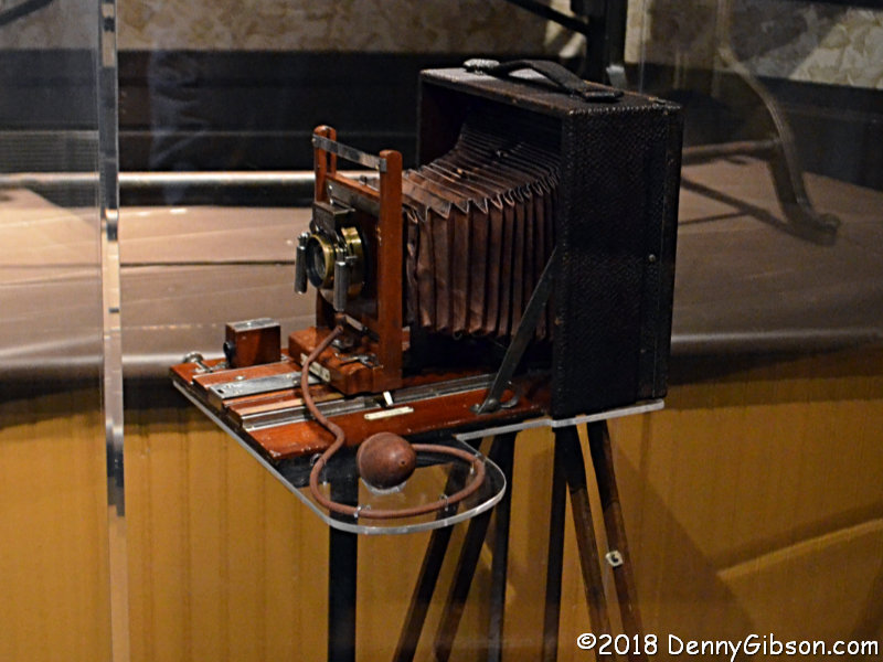
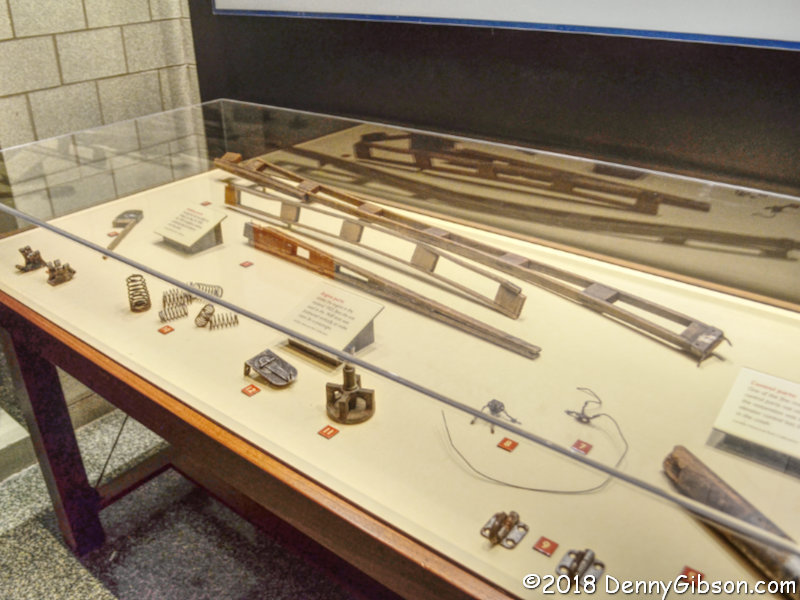
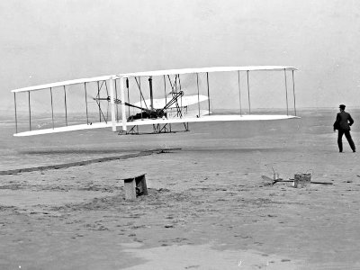
The Outer Banks and the Wright Brothers’ first flight are firmly joined in my mind. Although I’ve no problem remembering the year (1903), the month and date weren’t as easily recalled. I quickly looked it up the instant I first started thinking of the Outer Banks as a target for this year’s Christmas Escape and was very happy to learn it was December 17; Barely a week before Christmas Day, four days before the Winter Soltice, and five days before a full moon.

I’m beginning the trip with a dash to the Wright Brothers National Memorial at Kitty Hawk to celebrate the 115th anniversary of the flight. I’ll stay on the Outer Banks for a few days so may be in the area for those other holidays too. If not, I’ll be somewhere along the route home. That route is not yet determined although I’m leaning toward picking up US-64 at its eastern terminus and following it all the way through North Carolina. Then all I’ll have to do to get home is turn right.

This entry is to let blog only subscribers know about the trip and to provide a place for comments. The journal is here.

Book Review
Textures of Ireland
Jim Grey

A funny thing happened on the way to this review. Not funny ha ha; Funny peculiar. This is Jim Grey’s second book. I reviewed the first, Exceptional Ordinary, in April, 2017. I figured that this review would reference that one, make some comparisons, make some jokes. It would be fun; Maybe even funny ha ha. But that review has gone missing. I don’t know how or even when. I’ve plugged the hole left by the disappearance, but my memory’s way too far gone to try recreating the original review. The best I can do is try to compensate by being twice as impressed with Textures of Ireland as I would be otherwise.

That’s a joke, of course. It’s also impossible. I’m not saying that the book has pegged my impression meter, and that I couldn’t possibly be a little more impressed with it. I’m just saying that it has put the meter close enough to the max that there’s no room for doubling. I’m even impressed with the title. I think I would have picked up on the role that the various surfaces, from rough rock walls and bluffs to smooth water and glass, play in these photos, and I may have even happened upon the word “texture” at some point, but I can’t be certain. It’s the perfect word and I think having it in the title got me focused properly from the beginning. I don’t doubt that some would prefer not to be steered in anyway at all but for me I feel it was a good thing.

Grey’s considerable writing skills see very little action in Textures of Ireland. The first page is filled with text describing the trip he and his wife made to Ireland in 2016. Neither had been there before, and for her the trip included visiting homelands she had never seen and talking with relatives she had never met. The page also provides some common background for the book’s photos. All were taken with a Nikon N2000 and 35mm lens using Kodak T-Max 400 film. There is some discussion of the reasons for choosing that combination which include the camera’s ability to take quality photographs while being rugged enough to survive the casual handling and mishandling that seem to just naturally be part of vacations. The camera’s ready availability at reasonable prices was very much a factor since it meant that a camera disaster wouldn’t automatically be a financial disaster.

Without counting, I’m sure that first page contains more words than the rest of the book combined. The camera, lens, and film are the same for all thirty-five photos and the only additional information Grey shares on each one is their location. Clearly he expects the pictures to stand on their own. They do.

Although I’m sure I’d feel cheated if they weren’t there, even the few words that identify a photo’s location aren’t really necessary. Knowing where any of these pictures were taken does not make me appreciate them any more or any less. I’ll admit that a couple of the pictures made me curious enough to check out the location before I studied the image, but more often than not I’d spend some time soaking in an image then move on without knowing or caring where it was taken. The two exceptions were a picture of people walking over an unusual jumble of rocks and the picture of a hairpin turn on a steep road. The jumbled rocks were part of The Giant’s Causeway, and I think I liked knowing that because it was a name I’d heard before. The hairpin turn was in Glengesh Pass which meant nothing to me but became a place I might seek out if given the chance.

I’m not enough of a student of photography to understand why black and  white images convey texture better than colored ones. Maybe it’s because the absence of color forces the viewer to notice the shadows which are visual indicators of texture, or maybe it’s something else that I understand even less. About three months ago I was able to look over some original prints of some of the most well known photographs in the world. It was at an exhibit called “Ansel Adams: A Photographer’s Evolution” at the Taft Museum in Cincinnati. No, I’m not about to compare Jim Grey to Ansel Adams, and I won’t even try comparing any of their photographs, but I will say that some of the same things that make Adams’ images worth looking at can also be found in some of Grey’s images.

I have other favorites besides the previously mentioned Giant’s Causeway and Glengesh Pass pictures. Two of them face each other. On the left a path bordered by tall (marram?) grass curves out of sight with water and a distant shore in the background. The photo on the right hand page starts with a layer of sand at the bottom, moves to a bit of shallow smooth water, then some deeper water covered in small waves. Above that is a dark shoreline and the whole thing is topped by a sky filled with fairly angry looking clouds. A few man-made objects dot the shoreline with the straight lines of what looks like a building pretty much dead center. Both pictures were taken at Rosses Point Beach, and both pack a variety of textures into the frame. I also quite like a photo of Kylemore Abbey reflecting on itself and one of small boats tied up at Portrush.

I said there were thirty-five photos but that’s not quite true. There are thirty-five interior pages with one photo each. One of these also appears on the front cover. It looks out through the doors of Kylemore Abbey. There is also a photo on the back cover. It does not appear inside and it has no identification at all. In it are columns that go from a coal black silhouette in the center to some reasonably well lighted ones on each side. The columns are at least similar to some inside the book in photos taken at Sligo Abbey. Maybe they’re the same; Maybe not. It’s a cool picture in any case and a little mystery is not a bad thing.

In that missing review of Jim’s first book, I commented on the quality of the printing and binding. It was the first time I had seen a Blurb product and I happily reported that it was not crappy. It was quite good, in fact, and so is this one. The pages are fairly heavy semi-gloss and the printing is quite sharp which helps bring out the, you know, texture of the decidedly non-crappy photos.

Textures of Ireland and Exceptional Ordinary are available digitally or in paperback here.

Carillon Christmas

For the fourth time, the giant bell tower that gives Dayton’s Carillon Historical Park its name has been turned into a tree of light rising 200 feet above the park. The tree is quite visible from I-75, and I’ve seen it every year as I drove through the city, but this is the first time I’ve stopped for a closer look. The 20,000 bulb tree is merely the biggest feature of a month long celebration involving the entire park.

I obviously knew about the big tree but I encountered the rest of the party more or less by accident. I entered the park to enjoy some of its historical aspects and took a few pictures during regular hours. Regular hours means before 5:00 PM when the park normally closes.

I finished up my daytime stroll a little after 4:00 and headed to Carillon Brewing for some ale made the old fashioned way and one of the biggest mettwursts I’ve ever seen. When I entered the brewery, the crowd was sparse. When I left, the place was completely full with a line at the door. The parking lot, which had been nearly empty at 4:30, was packed an hour later. Sunset was at 5:14. The Christmas related activities begin and all the lights go on at 5:00. I took the picture at the start of this article just before I reentered the park roughly half an hour after sunset.

During my daytime walkabout, I’d noticed smoke coming from the kitchen behind the bakery, and paused to visit with the lady stirring up gingerbread cookie batter. I now stopped in to wash down one of the  cookies baked in the wood heated brick oven with cider heated over an open fire.

Every building, bridge, and other structure in the park was decorated for the occasion. A small train took passengers, including me, on a tour of the large open and decorated area behind the buildings. This tiny engine pulled over a dozen passengers, more than half of whom were full sized adults, through the arches and past the trees without even a hint of struggle. I was impressed.

Other activities included a puppet show, Christmas cards being printed on a 1930s era press, a place to write and mail letters to Santa Claus, and a place to talk to the jolly gent in person. I paused inside the main building to warm up and listen to these talented carolers before leaving the park.

I snapped the first of these three pictures when I arrived at the park around 2:30. The second one was taken about a quarter hour after sunset at 5:38. I didn’t actually see it, but my understanding is that those 20,000 white lights came on at approximately 5:00. The sun had been gone a long time when I took the third picture about 7:15. The carillon rang out Christmas songs throughout the evening. It had been completed in 1942 and the first official concert took place on Easter Sunday of that year. That was not, however, the first time the bells were heard. Although work remained, construction of the carillon was nearly complete by the winter of 1941 and Dayton was treated to an impromptu concert on Christmas Eve 1941; Just 17 days after the bombing of Pearl Harbor.

A Carillon Christmas continues through December 30. 5:00 to 9:00 Sun-Thu, 5:00 to 10:00 Fri-Sat.

Book Review
Vintage Signs of America
Debra Jane Seltzer

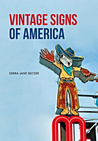
I photograph a fair number of signs as I travel, and I know quite a few people who photograph many more than I. Not one, however, is in the same league as Debra Jane Seltzer. If sign hunting was an Olympic sport, the petite Seltzer would be buried under gold medals. Her photo expeditions are legendary. Until recently, when she and her dogs (currently four) headed out in the white Chevy van named Sparkle, they would take along a big stack of notes and marked up map printouts. Today there might still be a printed list of targets but Google maps and a smartphone have reduced the need for paper considerably. The target list is never limited to signs. It’s almost certain to include interesting buildings and other roadside attractions of all sorts.

Seltzer’s website, Roadside Architecture, is the primary beneficiary of these expeditions. It currently contains more than 60,000 searchable photos organized by subject and location. It’s described as “Buildings, signs, statues, and more”. Photos are added and other maintenance is performed between trips. While traveling, Seltzer maintains a blog with stories and pictures from the road and a Flickr account with pictures that didn’t appear in the blog and probably won’t make it to the website. Links to these and more can be found at the Roadside Architecture website.

So why a book? Even though the subject matter of the structured website, the blog, and the Flickr account is essentially the same, they have different uses and different audiences. A book’s audience is different yet. In reading the book, I spotted a couple of signs that could be within range of upcoming travels. As I put them on my own list, I realized that the book could be used as a “shopping list” for travelers. The website, of course, is a super shopping list and both the blog and Flickr can can be sources of things to see, but the printed page is consumed differently and if the book gave me some ideas I’m sure it can do that for others.

However, before I thought of Vintage Signs of America as a shopping list, I thought of it as a primer. There is a one page introduction which, in addition to providing an overview of the rest of the book, offers a little insight into why Seltzer likes signs and why you might, too. This introduction page and a few near the book’s end where the subject is preservation are the only pictureless pages in the book. The other pages are filled with roughly 175 color photographs divided into five chapters. The first of these, “Types of Signs”, is where I got the idea of the book as a primer. Examples of bulb, opal letter, mechanical, and other types of signs appear with descriptive text. It prepares the reader for recognizing the various types in the wild and also provides a little history of advertising and the sign industry.

The next three chapters form what Selzer refers to as the “theme” section of the book. One chapter focuses on “People” with sub-themes like chefs, women, cowboys, and Indians. I was a little surprised with the statement that “There are far fewer representations of women than men on surviving vintage signs”, and considered why that was so. For starters, most of those chefs, cowboys, and Indians are male. The neon women my male mind first thought of were bathing beauties diving into motel swimming pools. Women are portrayed in other roles but not often. Evidence, I suppose, of women being even more underrepresented in the ’40s , ’50s, and ’60s, when most of these signs were made, than today.

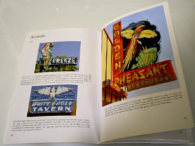
The “Animals” chapter is probably my favorite. Colorful birds, fish, and dogs draw customers to businesses of all sorts. Sequenced neon segments can make birds appear to fly and dogs and horses appear to run. A pig almost always indicates a BBQ restaurant although one sign shows a line of pigs merrily leaping in to a grinder to be made into sausage.

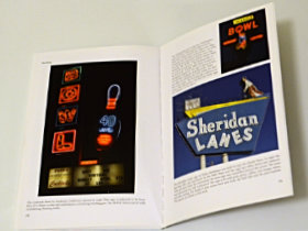
“Things” is as varied as you might imagine. Bowling balls and pins are popular as are skates, cars, and assorted food items. Donuts and ice cream cones seem to be the most common edibles used to attract customers. Bowling balls lend themselves to animation and when a neon bowling ball rolls, a strike is virtually guaranteed. Together, “Types of Signs” and the three chapters of the “theme” section make up a sort of sampler of the massive Roadside Architecture site. Picking less than 200 images to populate this sampler had to be tough but the choices made were excellent.

Like the signs themselves, the color photographs snag a reader’s attention. They’re all good eye-candy and some, like those with running animals, flying footballs, or operating machinery, require some amount of study. The pictures are far from alone, however. Every picture has an extended caption that describes the sign, often tells its history, and sometimes includes more general information. As Seltzer tells it, “I snuck facts and history into captions which makes it easier to swallow.” Easy to swallow describes the whole book. Even though it may look like a picture book, it seems quite natural to read it front to back and absorb those “facts and history” along with the images.

The last chapter, “Preserving Vintage Signs”, has those pictureless pages I mentioned earlier. It begins with a couple of pages of text that is sort of a “state of the signs” message. Here Seltzer tells of what has been happening to signs and why. The last page is also all text with some answers to the question “What can I do?” In between are descriptions, with pictures, of the big three sign museums in the country: The American Sign Museum (where I bought my copy of the book) in Cincinnati, OH, the Museum of Neon Art in Glendale, CA, and the Neon Museum in Las Vegas, NV. The whole chapter, and the final page in particular, might just be the inspiration someone needs to get involved is saving or documenting vintage signs.

So I’m thinking that some folks will get inspiration from this book, some will use it as a shopping list for their own sign hunting, for some it will be an introductory primer into the world of signs, and others might see it as a sampler of the full Roadside Architecture web presence. Those are all valid uses for the book and it will satisfy all of them quite nicely. Of course, some might see the book purely as a nice presentation of some very pretty pictures. There’s certainly nothing wrong with that. With the few exceptions noted, there are pretty pictures on every page.

Vintage Signs of America, Debra Jane Seltzer, Amberley Publishing, April 1, 2018, 9.2 x 6.5 inches, 96 pages, ISBN 978-1445669489
Available through Amazon.

National Veterans Memorial and Museum

Ohio has a new museum. The National Veterans Memorial and Museum opened on October 27. I visited on November 30 and confess to being drawn more by the building than anything else. Pictures I’d seen made the circular structure look both beautiful and unusual. I was also intrigued by what might be inside. I’d skimmed pieces of the Museum’s website and noted what I thought was a slogan. “A national museum where veterans, not war, come first,” turned out to be the headline of a CNN report on the museum rather than a slogan. Before I read the report and while I thought the phrase a slogan, I wondered just how much could veterans be separated from war?.

Before I went inside to answer my question, I explored a bit of the museum’s exterior. The Allied Works Architecture designed building sits on the banks of the Scioto River near downtown Columbus. Despite its nearness to the city’s tallest buildings, it is surrounded by open space nicely landscaped by OLIN. Columbus has done a nice job of keeping the river banks open and green. Directly across the river from the museum is the field where I watched fireworks in July. The Rooftop Sanctuary is accessed by a ramp curving along the side of the building and offering views of the city and river. After soaking up the views from the top, I headed back down the ramp to the main entrance.

When the subject is military veterans, avoiding war references is impossible. The museum does not push details of our various wars, but those wars are major markers in our historic timeline. The focus is on people. One of the displays encountered early on talks about taking the oath that separates a person’s civilian existence from the military one. An oath signed by Alexander Hamilton in 1778 is featured in the display on evolving oaths.

There are several interactive exhibits in the museum and here’s one I found a little troubling. The touchscreen allows a slider to be moved from 1950, when the U.S. military was present in 74 countries, to 2018, when that number is 154. The Peace Corp is currently active in 65 countries.

There are several videos as well. Some are “on demand” while others, like this one about coming home, run continuously. The first picture is a screenshot showing a celebration at the end of World War II. The second is a much more recent scene of soldiers returning from the middle east. In between are images of many other homecomings including Vietnam where a soldier tells of leaving his uniform in an airport restroom to avoid “greetings” from protesters. A friend of mine tells an identical story. As we continue to get involved in wars even less popular and more poorly justified, we have at least learned to distinguish those promoting war from those caught up in it. I am not a veteran myself and have no homecoming experience of my own. Of the two veterans closest to me, I missed out on my Dad getting home from World War II but I was there when my son got home from Operation Iraqi Freedom.

Many of the stories presented at the museum involve the struggles and accomplishments of veterans after their discharge. Some, like Tammy Duckworth and John McCain, are well known but there are plenty of unknowns who overcame just as much and made equally valuable contributions to society.

I was somewhat conflicted about this museum from the moment I first heard of it. Part of that was due to the obvious difficulty in celebrating the warrior without celebrating the war. That has been handled fairly well. Another part came from questioning the appropriateness of spending large amounts of money on the building when so many of the people it sets out to honor are in need of shelter, food, counseling, and more. The museum does promote various veteran organizations and its conference rooms and Rooftop Sanctuary will no doubt host many discussions and gatherings, but whether or not that was the best use of the money remains a valid question. I’m also not entirely comfortable with this sign on the wall of the museum’s third level. There’s not a whole lot there other than some space for contemplation, and I’m sure it’s tough to organize anything related to the military without someone bringing up the lives that have been lost, but many Americans seem to have a really tough time distinguishing between Memorial Day and Veterans Day and this probably won’t help.

I began this post by noting that it was primarily the stunning building that attracted me. I think I like it even more after seeing it in person. The building and grounds are a beautiful addition to downtown Columbus. The museum may also turn out to be a beautiful addition to the lives of veterans. Time will tell.