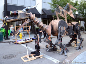
 This is the second coming of BLINK. The first was in 2017 when I underestimated the crowd, arrived too late, and missed the parade entirely. That story is here. This year I arrived in plenty of time, again underestimated the crowd, and missed the parade mostly. Reinforcing the claim that I arrived in plenty of time are pictures, like the one at right, of parade entries in the staging area. I could have taken up a spot in the front row of spectators but chose to roam around rather than stand still for an extra hour or so.
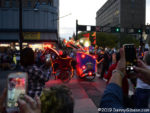
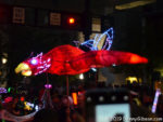
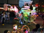 When I did decide to settle down, I thought I’d found a spot near the start behind a single row of spectators that I could see over. That turned out to be something of an illusion, however. There was a row of cell phone wielders seated on the curb and a steady wall of passers-by who tended to pause for extended periods until “encouraged” to move by the folks whose view they were blocking. Even so, I managed a few only slightly blurry pictures, including one of a glowing snail I had caught unlit in the staging area, before my phone rang.
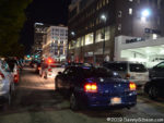 For something more than a day, I had been expecting (or at least hoping for) an important phone call. My fears that it would arrive at the worst possible moment were justified. The parade started moving around 7:20; The call came at 7:32. I simultaneously accepted the call (it really was important) and the fact that I would see no more of the parade. I paralleled the parade route one block away but the route itself was lined by a more or less impenetrable wall of spectators about six deep. The picture is of 3rd Street. Despite being crossed by the parade, plans called for the westbound 3rd and eastbound 2nd to be kept open. That was clearly easier said than done. The cars at the left of the picture are in curbside parking spaces; The rest are not. The car in the foreground is running with its lights on; The rest are not. They are effectively parked in the street with many drivers and passengers beside or on top of their vehicles.
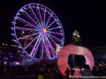
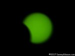
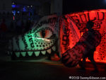 I believe the giant ‘O’ is the one I could see above the parade route people wall. The big wheel is a permanent fixture on Cincinnati’s riverfront. I snapped the picture of the big dog as it headed off to a garage at the end of the parade. It’s another entry that I’d caught in an unlit state. I never did see the dragon in the opening photo in motion.
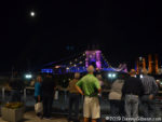
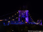 Even though I couldn’t actually see that parade, I went ahead with my plans to reach its endpoint because I wanted to see the nearby Roebling Bridge. It had been the subject of a lot of BLINK promotion but I wasn’t nearly as impressed as I thought I’d be.
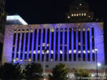
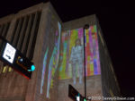
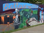
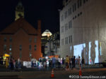 I’d read the advice about picking your targets at BLINK, but I ignored it. I’d done no planning in 2017 and stumbled into something impressive every block or two. I expected to do the same as I headed back north from the riverfront. It didn’t happen. I wondered if my sense of awe was dulled by having seen the technology before. Or maybe my disappointment at missing out on the parade was spilling over into other areas. Both of those are probably at play but I decided there was more to it when I reached the lot in the third photo. In 2017, one of my favorite projections had been here. The brick wall had been the target of a King Records themed projection. This year the lot held the light source for shadow puppets.
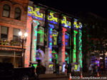
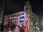 I crossed the street and ducked into the Bay Horse Cafe for a Hudy and contemplation. I developed no insight but enjoyed the beer and stepped out with my attitude slightly adjusted and ready to enjoy whatever I encountered. A rather nice projection (Purpose and Play) at 8th and Walnut was followed by the lighted seesaws on Court Street. The seesaws were down by the river in 2017. I think they looked better in that location, but folks were definitely having a good time with them here. My favorite projection of the few I actually saw was Razzle Dazzle at the Ensemble Theater.
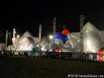 In Washington Park, I captured the giant bouncy house that is Dodecalis. It’s one of the few BLINK installations with an entry fee and the only one (AFAIK) that requires shoes to be removed. My car was nearby and I headed there undecided if my sense of being underwhelmed was justified but too exhausted from walking to really care.
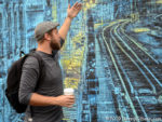 On Friday, I was back. B & H Photo Video, where I’ve spent a little money over the years, sponsored several BLINK related walks led by professional photographers. I took advantage of one in the Findlay Market area led by Derek Hackett of ChopEmDown Films. That’s Derek at our first stop, a mural literally just completed by Logan Hicks.
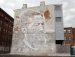
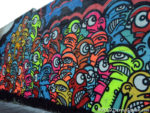 I found the face-on-the-wall extra interesting because it is carved into the surface. It is the work of a Portuguese artist using the name Vhils. The many eyes and bright colors of the second mural make quite a contrast to the photo-like monochrome carving. A bit further on, we encountered Galo, the artist who did it, working on a standalone piece.
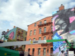
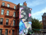
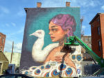 Even though BLINK officially opened Thursday, Galo wasn’t the only artist at work on Friday. Two of them were finishing projects almost side by side, and both Tatiana Suarez and Elle waved to members of our group as we watched them at work. It was immediately obvious that, in addition to having fantastic artistic talent and the ability to work on a very large scale, these people must be able to operate that lift with controls mounted on the platform.
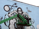 We visited several more murals and I took bunches of pictures but I’m only going to include one more from Friday’s walk. It’s another work in process. It is the work of a group calling themselves the London Police and I found it extra interesting because of the subject. The face in the center of the mural belongs to Tatiana Suarez who we just saw painting the mural of the lady and the swan.
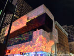
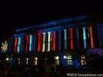
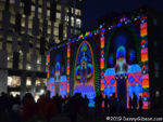 I returned to BLINK yet a third time on Saturday. There are installations on both sides of the river this year and my original plan had been to attend two nights so I could check out the displays in Kentucky. After Thursday’s mild disappointment, I wasn’t quite sure I wanted to go back, but Friday’s experience and seeing photos posted by others convinced me that I’d been the victim of bad luck, my own attitude, and a lack of planning. Saturday’s experience was more in line with my expectations. I parked in Covington, walked across the Roebling Bridge into Cincinnati, and checked out a few specific installations. They included an untitled work from Saya Woolfalk and the projections at the courthouse and the Contemporary Art Center.
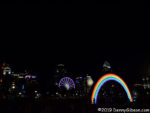
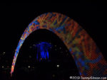
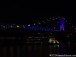 Then I headed to the riverside and the giant rainbow that first appeared at Burning Man. The constantly changing LEDs make the thirty-foot arch much more than a rainbow. In the second photo, it frames one tower of the Roebling Bridge which I appreciated much more this time than I had on Thursday. The bridge is sometimes called the “singing bridge” because of the sounds made by tires on its grated deck. Recordings of some of the bridge’s sounds have been used to produce some slightly eerie but overall very pleasant music that is played through speakers in the park. My improved appreciation was no doubt aided by that music and the view of the bridge from water level.
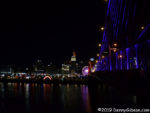
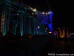
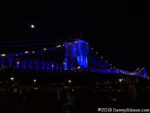 There had been very few people on the bridge when I came north. It was now packed. It is closed to vehicles during the festival but both pedestrian walkways are open and filled. It had taken me several minutes to reach the point on the bridge where steps lead to the park. It took right at half an hour to reach the Kentucky shore from those steps. I probably spent a total of forty-five minutes shuffling over the bridge and overheard claims of an hour didn’t now seem as preposterous as they had when I first heard them on the Ohio side.
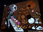
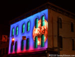
 In Covington, a London Police mural is the base for an animated projection. I can’t help wondering who the model for the female figure was. Could it be mural artist Elle? I’m fairly confident that the model for the projection in the second picture is the world’s largest disco ball which people are dancing beneath just half a block away.
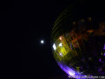 There is one day of BLINK remaining but I don’t anticipate another visit. It could happen though. Tonight that moon will be completely full.
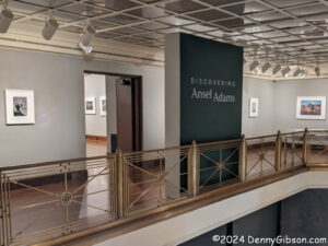 I post a lot of pictures on the internet, and occasionally, someone will say something nice about one of them. Any photo of mine that is worthy of a compliment is invariably the result of me accidentally being in the right place at the right time. Just like Ansel Adams — except for the “accidentally” part. The remarkable landscape photos that Adams became famous for were almost always the result of significant study to determine just what the right spot and right time were and usually some significant effort in getting there. The Discovering Ansel Adams exhibit contains plenty of those famous landscapes along with many of his lesser-known works.
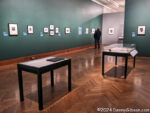
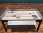 The exhibit begins with items from the not-yet-famous part of his life. In addition to family snapshots and letters, one display contains a compass and some light meters used in the complementary “getting there” and “getting the shot” aspects of Adams’ work. The leftmost picture on the wall is the earliest landscape photo by Adams in the exhibit and probably the only one that is fairly well known with the word “inadvertently” in a description from Adams himself. Taken on his very first visit to Yosemite with his parents, the photo and description are here.
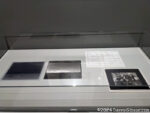
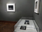
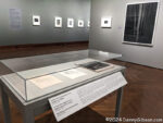 Black and white photos from large format cameras are most commonly associated with Adams and those make up the bulk of the exhibit. Many, but not all, are of various national parks. A couple of photos are accompanied by display cases holding backlit negatives and associated laboratory notes.
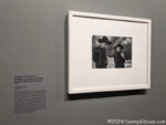 To support his fine art tendencies, Adams did a fair amount of commercial work including some in color. He even took pictures of people now and then and sometimes used small handheld cameras instead of bulky tripod-supported boxes. Sometimes, he even took pictures for his own enjoyment. Several things we don’t normally associate with Ansel Adams are associated with this photo of Georgia O’Keeffe and Orville Cox, described here, that shows the same crisp detail seen in his large-format people-less landscape work.
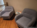
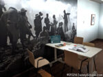 Copies of several of the books that Adams authored or contributed to are available to leaf through as part of the exhibit. I spent some time in one of those padded chairs reading bits from The Camera. The exhibit runs through January 19, 2025.
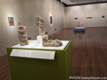
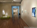 I also took in CAMaraderie: Artists of the Cincinnati Art Museum while I was at the museum. This impressive exhibit is comprised of numerous works of art from members of the museum staff. It runs through January 5, 2025.
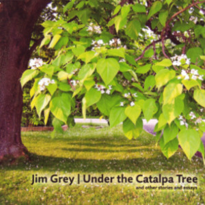 Like pictures? It’s got ’em. Like variety? Got that too. There are enough pictures to fill a deck of cards or a weekly calendar, which is not accidental. The premise for the book was writing an article to accompany a photograph every week for a year. That could very well be a student assignment in an overly long writing course and in a sense it is. Jim Grey assigned himself the exercise to, as he says, “strengthen this muscle”. He is referring to the writing muscle which can surely benefit from practice just as much as a musician’s skill or an athlete’s strength.
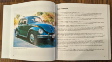 Even though photographs are at the heart of Under the Catalpa Tree, the book’s subtitle mentions only “stories and essays”. I’m guessing that is at least partially because only the stories and essays needed to be newly created for the book. The photos already existed from Grey’s many years of photographing the world around him. He doesn’t explain how the photos were selected. I am sure it was not completely random but there is tremendous variety. They range in quality from slightly fuzzy black-and-white snapshots taken years ago with a yardsale camera to crisp color images taken with high-end gear and well-developed skills. Some photos are digital but film is the source of many of the images since Grey collects — and heavily uses — film cameras. Among the subjects are family, friends, cars, houses, nature, and an abbey in Ireland.
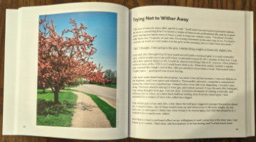 A detail I appreciate is laying out the book so that all images are alone on a left-hand page. That happens naturally when the text occupies a single page, which is common, or three pages, which is not. There are quite a few two-page essays where a blank is used to get things back in synch. Totally worth it, in my opinion. Those pages, by the way, utilize Amazon’s premium paper which has the photos looking their best.
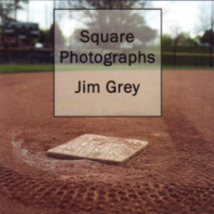
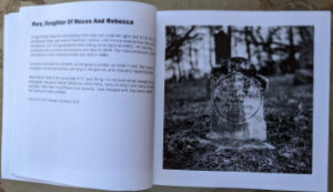
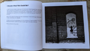
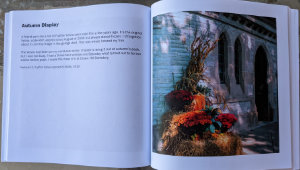
 Jim Grey blogs, collects film cameras, uses those cameras, develops the film himself, walks, bikes, and observes. Put them together and what have you got? This book.
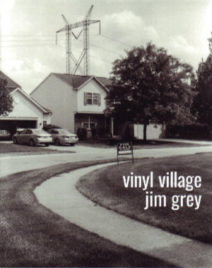
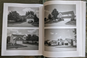 It is a story about the neighborhood in which he lives, and where he interspersed COVID-triggered working-at-home with some calorie-burning walking-near-home. We are introduced to the neighborhood as a collection of modestly priced homes in an area of pricier residences. A big attraction is access to very good schools at somewhat bargain prices. Although the location makes them bargains, they are hardly shabby and actually look quite attractive — from the front.
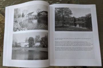 Construction is wood frame with vinyl siding and brick accents. Those accents, however, are almost entirely on the front of the houses. The other three sides are the focus of the story. Part of Grey’s story is about these sides being exposed by the curving streets, numerous retention ponds, and open spaces created by electric and gas lines.
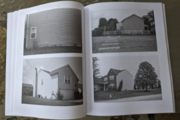 The rest of the story is about those exposed surfaces and areas being a long way from handsome. The story’s name comes from the large expanses of vinyl siding exposed by those curves and ponds. Windows are few and from the outside often appear to be placed rather randomly and often awkwardly. Many side walls are unbroken by any windows at all.
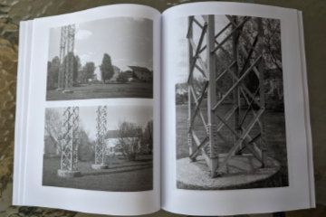 There are few words but lots of pictures. The pictures are black and white and large. The most common arrangement is two 4×6 inch photos to a page. Where words do appear, they typically share a page with one of those 4×6 photos. Occasionally a photo gets a page all to itself which lets it grow to approximately 5 1/2 by 8 1/4 inches. Grey has changed publishing platforms (from Blurb to Amazon) for this project which results in some physical differences from the previous essays. The pages are slightly smaller (8×10 vs 8.5×11) and the paper used is uncoated rather than semi-gloss. Photo quality does suffer but again it is the subject of the picture that is important. The pictures are here to document the subject and illustrate Grey’s story, not to be admired in and of themselves. It’s an assignment they handle quite well.
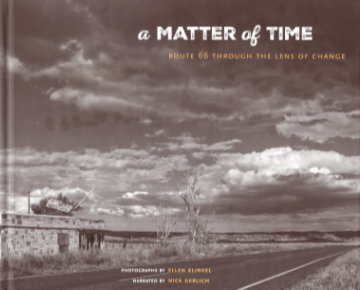 There’s not much point in counting the number of books published about Route 66; The likelihood that the count would increase before you were done is just too great. An Amazon search simply says “over 2,000”. So why review this one? What sets it apart from the others? The most obvious reason for reviewing it is a simple one: I know one of the people whose name is on the cover. The things that set it apart are not as obvious (or benignly biased). In fact, I’ve only found one thing about the book that I think is actually unique, and I’m not really sure about that. The book has no author; It has a narrator.
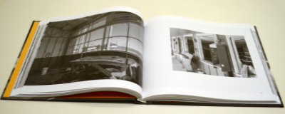 The photos are black and white, which is unusual but not unique. What may be unique is how they came to be at all. Klinkel tells that story in the book’s preface. It begins in 2013. She lives in Germany and was in the western U.S. with her husband for a four-week vacation which she describes as “the first time I ever had a serious camera in my hands”. Planned visits to several national parks fell victim to the sixteen-day government shutdown in October of that year and driving a portion of Route 66 was substituted. Klinkel credits this very first time on the historic highway coupled with the “serious camera” as having “instantly sparked my passion for photography”.
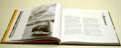
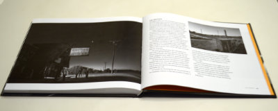 Most, but far from all, of the photos are of places I recognize from my own travels on Sixty-Six, and some of those nearly reproduce visions I’ve had myself. There are plenty of pictures of places I do not recognize. Sometimes that’s because they are from a location where I’ve never stopped or maybe even passed, but sometimes it’s because Klinkel sees and shares a vision that never occurred to me even though I’ve stood at or near the very spot she did. I don’t mean to imply that I expected anything else. It’s great to be shown something you’ve never seen, but it can be even better to be shown something known in a new way. Although it is a place I instantly recognized, a favorite example of being shown something in a new way is the early morning shot of the Bagdad Cafe with the coming sun just a tiny but significant twinkle. Another is the low-level shot of a protective wall of tires at a long-abandoned gas station at Texas Exit 0 of I-40.
 However, something clicked on a rereading of that preface that hadn’t quite registered on the first pass. Klinkel explains the title quite clearly:


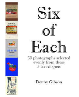 And now for something completely different. Anyone who thought releasing two books within three months might be overdoing it will have no doubts about that being the case when they see another appear a week later. But this is a different kettle of fish. Really. Six of Each is a collection of photographs drawn from the previously published travelogues. Each of those travelogues is available in two forms. There is a black-and-white printed version and a color digital version. Photo-quality color printing is still relatively expensive in the low-volume print-on-demand world. Printing the books in black and white keeps them reasonably priced. On the other hand, color in digital files is free. Offering B&W paperbacks and color ebooks isn’t ideal but it keeps the books affordable and color at least available.
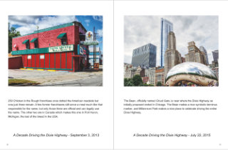 So what I’ve done is pick a half dozen pictures from each of the existing travelogues and combine them in a Blurb magazine. The magazine is only available through Blurb (that’s one of those magazine restrictions) and there is no digital version available (that’s my restriction). It’s also more expensive than it seems a 32-page “magazine” ought to be. But it does let me see what some of my photographs would look like using something besides black ink on stationary paper. And it’s there for anyone else who would like to look.
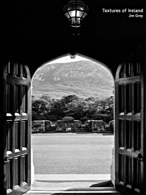 A funny thing happened on the way to this review. Not funny ha ha; Funny peculiar. This is Jim Grey’s second book. I reviewed the first, Exceptional Ordinary, in April, 2017. I figured that this review would reference that one, make some comparisons, make some jokes. It would be fun; Maybe even funny ha ha. But that review has gone missing. I don’t know how or even when. I’ve
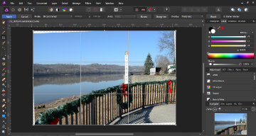 For me, up to speed isn’t all that fast. I’m basically a resize, rotate, and crop sort of guy. I was nearly at speed once those were mastered. I do, on occasion, dabble with tone a bit and do a little touch-up work. About as fancy as I ever get is the rare collage or the slightly less rare HDR. Accomplishing these with Affinity is quite different than with PhotoPlus but I eventually figured it out. I’m a long way from being a master of the software but I manage to do what I need.