Phirst FotoFocus Phinished

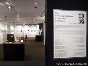
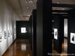
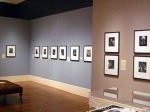
Paul Briol exhibit at FotoFocus 2012It’s officially over and I pretty much missed it. The inaugural FotoFocus festival ended along with October and, despite some good intentions, I barely caught a whiff. Of the over fifty exhibits that were part of the event, the only one I actually saw during regulation time was the “The Photographic Legacy of Paul Briol, 1909-1955” at the Cincinnati Museum Center. Briol’s photographs of Cincinnati in the first half of the last century are both documentation and art. He was a master in the dark room and learned to combine images to enhance the finished product. For example, a blank sky might be turned into a pleasant background by adding a few clouds. That was neither common or easy in those pre-PhotoShop days.

FotoFocus is the name of a a Cincinnati nonprofit that “champions the ubiquity of photography and its important role in contemporary culture.” It is also the name of the just concluded month long series of exhibits, presentations, and lectures. There were a couple of receptions and at least one lecture that I wanted to attend but each of those encountered a conflict. I had a whole month to take a look at the many exhibits but just kept putting it off. When I finally panicked and got serious, it was too late. I managed to get to the Briol show at Cincinnati Museum Center on Monday and two others on Friday. Of course, Friday was November 2 and the majority of exhibits were history. The two I visited on Friday were fairly major productions whose runs extend beyond FotoFocus.

Herb Ritts exhibit at FotoFocus 2012Herb Ritts exhibit at FotoFocus 2012On Friday, I headed first to the Cincinnati Arts Museum in Mount Adams to see “Herb Ritts: L.A. Style”. Since I do stop by here once in a while and wouldn’t feel the need to see all of the permanent displays, I thought my visit would be fairly brief. Though I did essentially limit my viewing to the Ritts exhibit and a traveling Toulouse-Lautrec exhibit at its entrance, it wasn’t exactly a dash in and out. For one thing, Friday was the first of three days of an expanded “Holiday Expressions” gift shop that filled the lobby. Secondly, several bus loads of students were touring the museum in groups of twenty or so. I love seeing kids in museums. They can be a little noisy and can sometimes block an intended path but they deserve to be there a lot more than I do. Kudos to the schools and teachers who get their kids out to see “stuff”. There also happened to be two musical performances going on. In the lobby, a string trio played on a balcony for the benefit of “Holiday Expression” shoppers and two fellows played and discussed some “old timey” music for the benefit of the students in the main hall.

“Herb Ritts: L.A. Style” was curated by Paul Martineau for the J. Paul Getty Museum. Although I was not familiar with Ritts by name, I definitely recognized some of his photos including the cover of Madonna’s True Blue album. Not all of Ritts’ assignments were successful from the client’s point of view. Several examples of his most impressive work came from assignments that were rejected because they matched Ritts’ vision a lot more than the client’s. Ritts’ vision was darned good.

Even now. it seems, Ritts doesn’t please everyone. There are some stunningly beautiful nudes in the exhibit. A sign at the entrance states this and suggests parents check out things and decide for themselves whether their children should see them or not. After I had viewed the exhibit, I stopped for a while just outside the entrance and listened to the musicians below. As I stood there, a fellow I guessed to be about sixteen or seventeen exited the exhibit and approached me. “My male instincts told me to go in there”, he said. “They were wrong.” There are nudes of both genders on display and I’m guessing that this was the teenager’s problem. I doubt he had ever before considered that the word “nude” was not synonymous with “naked woman”. Ah, the insecurity of youth.

“Herb Ritts: L.A. Style” runs through December.

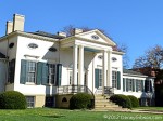
Edward Steichen exhibit at FotoFocus 2012Taft Museum of ArtThe other exhibit I saw on Friday was “Star Power: Edward Steichen’s Glamour Photography” at the Taft Museum of Art. To my shame, this was my first visit to the Taft since its major expansion and renovation in 2004. That meant I needed to look over the whole place and not limit my visit to the Steichen display. Christmas season is starting here also with Friday being the first day of “Antique Christmas”. This consists of a number of decorations, toys, and other Christmas related items from holidays far in the past spread throughout the museum.

Edward Steichen was a name I half recognized but couldn’t connect with anything in particular. It turns out that, had I made any sort of guess, there’s a good chance I’d have been right. He did a lot. He painted, directed movies, and played a key role in the publication of books and magazines and in the running museums. And he was a photographer. In World War I, he commanded the photographic division of the American Expeditionary Forces. In World War II, he was Director of the Naval Aviation Photographic Unit. His many activities between the wars included a fifteen year stint as photographer for Vogue and Vanity Fair magazines. That stint ran from 1923 to 1938 and I believe that most, if not all, of the photographs in this exhibit are from that period.

The title refers to “Glamour Photography” and his work for the world of fashion is well represented. It also mentions “Star Power” and the stars are all there: Greta Garbo, Katherine Hepburn, Joan Crawford, and many others including my fav, Claudette Colbert. The way Steichen handles light in these black and white images is remarkable as is his frequent use of stark high-contrast backgrounds. His lighting often adds a 3-D quality and both it and the composition automatically and consistently focus the viewer right where Steichen wants.

“Star Power: Edward Steichen’s Glamour Photography” runs through January 27.

Even though I missed the majority of FotoFocus exhibits, I did see three of the bigger ones. With the Annie Liebovitz exhibit I visited a couple of weeks back, that means I’ve been exposed to some of the best lens based art of the last century in a fairly short span of time. I’ve never called myself a photographer. In fact, after seeing what can be done, I’m almost embarrassed to even be seen with a camera. I’ll get over it and I won’t stop snapping pictures but it was a clear reminder of just why I never call myself a photographer.


On Friday morning, I wanted to check out something about FotoFocus via my phone but I misspelled FotoFocus. I did it by correctly spelling Photofocus. Photofocus is a long running website that I was aware of though not one I can claim to be familiar with. By coincidence Friday was Photofocus’ fourteenth anniversary. It was also the day that founder Scott Bourne announced his retirement. He is not retiring just yet. That will occur in exactly one year and the website will continue. Scott has already made arrangements to assure that. Accident, coincidence, and the reading of a couple of interesting articles made me think that maybe I should become familiar with Photofocus so I’ve subscribed to its RSS feed.

Controversy, Photos, and Inclines

I long ago reserved a seat on a bus tour of Cincinnati incline sites and had in mind that the Saturday outing would be the subject of this Sunday’s blog entry. But not only did Thursday’s visit to the Pumpkin Show result in an unscheduled post, it led to me visiting a couple of exhibits that I think worth mentioning. So, before getting to today’s feature, I’m presenting a couple of short subjects.


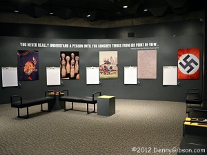
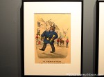
Ohio History Center Controversy 2Short subject one is Controversy 2. Rather than driving home from Circleville in the dark on Thursday, I drove just a few miles toward Columbus and grabbed a motel room then headed on to Ohio’s capital in the morning. My first stop was at the Ohio History Center where the second exhibit of controversial items in the Ohio Historical Society’s collections is in progress. The photo at the right is of an area at the end of the exhibit. Large pads of paper hang next to photos of the five items on display. Presumably the pads were there for comments but they were entirely blank when I saw them. Around the corner, several comments made on smaller cards were displayed. Most were positive regarding the exhibit and thoughtful regarding the items in it but a few were unhappy that the objects have been allowed into the light.

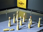
Ohio History Center Controversy 2Ohio History Center Controversy 2The first Controversy exhibit, which I missed, included a hooded KKK costume and a nineteenth century condom. Controversy 2 contains an original Cleveland Indians Chief Wahoo jacket from 1946, children’s toys depicting ethnic stereotypes, degrading racial caricatures, a poem written in dialect, and a Nazi flag. The cloth bowling pins were made sometime before 1914. An adjacent description is here. The prints were published by none other than Currier and Ives between 1882 and 1893. A dozen or so are displayed. Their description is here. The line at the bottom of the print shown here is “De gals all mire me so much dey makes me blush.”


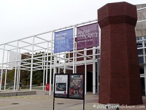
Wexner Center, Columbus, OhioNot surprisingly, no photos were allowed at my next stop, an exhibit of Annie Leibovitz photographs at the Wexner Center. I’m not at all bothered by that since I am not all that fond of taking pictures of pictures and, in this case in particular, doing anything near justice to the subject was clearly out of the question. The exhibit includes all of Master Set and much of Pilgrimage. Master Set consists of 156 images hand picked by Leibovitz to represent four decades of work. Most are from professional assignments but there are some family shots in there, too. Pilgrimage is made up of photos that Annie took for herself. There are no people in these photos but every object and location is firmly associated with an historical figure.

The walls are filled with remarkable images but I’m going to comment on just two. My favorite in Master Set is a 2001 picture of Pete Seeger standing at the edge of the Hudson River wearing hip-high waders and a banjo. It can be found online with a search for Leibovitz and Seeger. I want to grow up to be as happy as Pete Seeger looks in that photo. In Pilgrimage, I was drawn to a picture of Annie Oakley’s boots taken at the museum in my home county. I’ll certainly look at those boots, that I can now connect with two sharpshooting Annies, a bit differently on my next visit.


Inclines and Overlooks Tour, CincinnatiThe Cincinnati Museum Center conducts a number of Heritage Tours each year including several that are repeated every year. One of those is Inclines and Overlooks. I’ve signed up for this in the past but didn’t get to attend because of a schedule overload. This year I made it as the feature event of a busy weekend. Unfortunately, a lot of clouds were also able to attend this year and there was even a little rain but that did little to dampen spirits on the sold out tour.

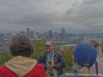
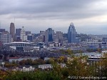
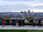
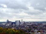
Inclines and Overlooks Tour, CincinnatiInclines and Overlooks Tour, CincinnatiOur first stop was in Kentucky’s DeVou Park which provides a great view of Cincinnati. From here our guides could point out where the city’s five inclines were and explain why they were needed. There were four guides on the tour; All excellent and all of who’s names I’ve forgotten.

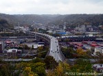
Inclines and Overlooks Tour, CincinnatiInclines and Overlooks Tour, CincinnatiThen it was back to Ohio where we would eventually visit all five incline sites. The first was the Price Hill Incline on the west side of the city. This was the second incline built in Cincinnati and the next to last to die. Constructed in 1874, it operated until 1943. A turn to the right yields a nice view of the Ohio River and the Southern Railroad Bridge.

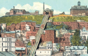
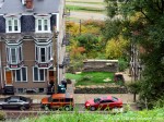
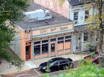
Inclines and Overlooks Tour, CincinnatiInclines and Overlooks Tour, CincinnatiI make multiple goofs in preparing every blog post and journal entry. Most I can simply ignore but some, like forgetting all the guides’ names and not getting a skyline shot from the Mount Adams overlook are hard to conceal. Instead, I’ve got a shot of some of the piers from Cincinnati’s last incline and an overhead view of one of my favorite taverns. I briefly thought of trying to cover my oversight by claiming that I intentionally omitted a view of the city because I wanted you to visit the City View Tavern so you could experience the view for yourself. I quickly realized that it wouldn’t fly as an excuse but it’s still a great suggestion. The Mount Adams Incline opened in 1876 with two enclosed passenger cars. Three years later the incline was converted to open platforms which would carry horse cars, and eventually electric street cars, to and from down town. The Mount Adams Incline is shown in the picture at the top of this section. It closed in 1948.

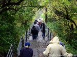
Inclines and Overlooks Tour, CincinnatiInclines and Overlooks Tour, CincinnatiInclines and Overlooks Tour, CincinnatiThere was a little rain at the Mount Adams stop and that may have contributed to my failing to get a proper overlook view. It definitely contributed to my failure to get one from the top of the Mount Auburn Incline route. It was also a deterrent to walking the stairs that essentially trace the route but that was outweighed by the fact that the bus would meet all walkers at the bottom. A chance to de-climb 355 steps without also climbing them doesn’t come along every day. The overlook views are from the top of the Bellvue Incline and near the midpoint of the Fairview Incline. Operating between 1871 and 1898, The Mount Auburn Incline was the first and shortest lived of the Cincinnati inclines. It was also the only one with fatalities. In 1889 a car plunged down the track killing six of eight passengers. The Bellvue Incline operated between 1876 and 1926; The Fairview Incline between 1892 and 1923.

I learned quite a few things on this tour including the fact that, while San Francisco was first and last with cable cars, Cincinnati had them, too. Between 1873 and the end of the century, as many as three cable car lines operated here. The power house for one of them still stands and is used for office space. Another surprise was getting a copy of Cincinnati Streetcars No. 2 The Inclines at the end of the tour. This was a gift from the Ohio Book Store and a reminder that it has been entirely too long since I’ve been inside that wonderful place.

This was an extremely well done tour. As I write this, I’m feeling guilty that I didn’t praise it more on the evaluation form. I’m also thinking that I just might try to sign up again next year and hope for better weather.

My Apps – Chapter 4
Serif PhotoPlus

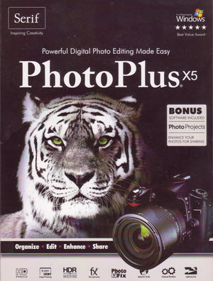
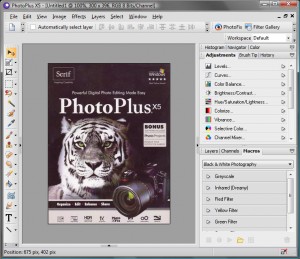
Serif PhotoPlus X5 packageI found Serif PhotoPlus when I was looking for free stuff in the summer of 2001. At that time, their practice was to make down level versions of some of their products available for free in hopes that you would eventually upgrade. That is precisely what happened to me. I believe that at the time I first started using PhotoPlus, Version 5.0 was the current product and version 4.0 was free. It looks like I may have continued using Agfa PhotoWise through early 2001, switched to the free PhotoPlus sometime in late spring, then parted with $22.90 for the current version after the big Florida trip in September.

To be completely accurate, I have to explain that one feature of the regular PhotoPlus was not exactly given away in those days. Compuserve’s patent on the GIF file format was still valid and royalties needed to be paid. If you wanted to read or write GIFs, you had to send Serif a dollar which they presumably passed on to Compuserve. That patent has since expired. Serif still offers free versions of their software except they are now reduced function Starter Editions rather than older versions of the full product.

Serif PhotoPlus X5 screen shotI’ve updated to most if not all PhotoPlus releases since 2001. It reached Version 12 before adding an ‘X’ and starting the numeric sequence over again. As the picture of the cover shows, it has now reached X5. As with many software products, some releases have been major advances and others have merely added a few bells and a couple of whistles. At this stage, I can’t think of any feature I’d like to see but I’m not really a power user. I’ll occasionally remove an overhead cable or deal with some red eye but mostly I’m just rotating, cropping, and re-sizing. I will play with brightness and contrast to improve a photo but even there I’ll likely use one of PhotoPlus’ automated adjustments. There are lots of features I rarely use and more that I never use.

I do admit to sometimes feeling like a Beta Max owner in a VHS world with just about everyone I know who edits photos using some version of Adode PhotoShop. That Beta Max comparison is a little weak in that the JPG, GIF, and PNG files I produce with PhotoPlus are the same format as everybody else’s and can be “played” anywhere. Plus, at some forgotten point, PhotoPlus added compatibility with PhotoShop PSD files. I have virtually no experience with full PhotoShop and only a little experience with a copy of PhotoShop Elements that came bundled with a scanner a few years ago. At that time I saw nothing in PhotoShop Elements that made me want to switch and there were a few features in PhotoPlus that I didn’t see in Elements. Familiarity with the PhotoPlus user interface is, of course, a huge reason for staying with the Serif product.

The reason I initially chose PhotoPlus, the big price difference between it and any similarly capable program, has lessened. Deals and discounts are always offered to existing users when a new release appears but the most recent update was still $49.95. That is a fraction of the $699 list price of the current Adobe PhotoShop Creative Suite but it’s not far off of the $60.99 price of PhotoShop Elements at Amazon.

I’m happy with PhotoPlus and I’m quite familiar with it. It does everything I need and a lot more. That talk about PhotoShop is mostly for others. I figured that, as a PhotoPlus user in a PhotoShop world, it was something I needed to include.

My Apps – Chapter 3 — Garmin MapSource


My Gear – Chapter 4
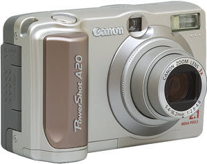
Canon PowerShot A20

Canon A20As I looked back over my travel gadget purchases, it was immediately obvious that many preceded a major trip. The idea of a long lived website, rather than a one trip experiment, started to form as I got serious about retracing a 1920 Florida trip my great-grandparents had made. Purchases were made during the summer of 2001 in anticipation of making the trip in late August. The first was a real upgrade in the camera department.
Some of the improvement over the Agfa came from a significant increase in price but a lot more came from two years of progress. Even with more than a hundred dollars off the $500 MSRP, the Canon PowerShot A20 cost over twice what I’d paid for the Agfa — $384 vs. $186 — but I now had a real camera. It had auto focus, 3X zoom, and 1.92 effective mega-pixels plus, apparently, 0.18 ineffective ones. This was good enough to convince me that I didn’t have to carry my film camera everywhere but not good enough to make me want to get rid of it. Digital was clearly the only way to feed a website but film was still the way to go for good sharp prints.

I believe it was about this time that a friend asked me to recommend a good digital camera and I answered that I couldn’t. There were some very good digital cameras being made but they cost thousands not hundreds of dollars. Nikon’s first digital SLR, the D1, came out in 1999. The 2.6 mega-pixel wonder retailed for $5580 — body only. The D1X came on the market in early 2001 at about the same time as the A20. With what is now a familiar characteristic of electronics, resolution, 5.4 megapixels, was up and price, $5350, was down. These were professional quality cameras with prices that could only be justified by professionals needing instant product. For an amatuer convinced he needed instant product to feed a website, even the few hundred dollar price of the little Canon wasn’t easy to justify. Of course, if financial justification was a real factor in any of this, there wouldn’t even be a website to feed.

My Gear – Chapter 3 — Garmin GPS III Plus

Book Review
Route 66 Sightings
Graham, McClanahan, & Ross

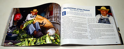
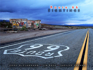
Route 66 Sightings coverI expected to be impressed by the images in Route 66 Sightings. They come from three of the best photographers ever to point a camera at Route 66. I didn’t expect to be educated though I now realize that I should have. Those three photographers, Shellee Graham, Jim Ross, and Jerry McClanahan, are also three of the most competent of Route 66 historians.
The first book I reviewed on this blog was a photographer-writer collaboration. That’s a fairly common arrangement. It’s not because the writer can’t take a decent photograph or because the photographer is illiterate or knows nothing about the subject.  It’s because one person typically produces better images while the other is the better word smith and/or more knowledgeable. The three people behind …Sightings are all quite adept at recording, remembering, and ‘riting.

Unlike many books connected with a road, the organization here is not geographic. No east to west or north to south. Instead, the photos are divided into categories. Roadside attractions and businesses that have completely vanished are pictured in a gallery (Yeah, it’s a lot like a chapter.) called “Gone”. Some that can still be visited, but just barely, appear in the “Used to Be” gallery. “Against the Odds” covers the rare business or attraction that continues being what it’s always been and “Rescued” covers those that live on by being something different. Roadside attractions with a recent beginning make up “New Kids on the Block”.

“Gone” is the first gallery and I believe it is my favorite. Of course, nothing in the gallery exists today. With very few exceptions, they were gone before I started paying attention to Route 66 in any meaningful way just shy of the turn of the century. So I get a glimpse of things that I’ll never see in the real world and that fact, no doubt, has a lot to do with the chapter being my favorite. Some of the subjects were still operating (Shawford Motel, Club cafe) or at least intact (Coral Court Motel) when photographed. Others (Conway Motor Court, Querino Canyon Trading Post) would be candidates for the “Used to Be” gallery if time hadn’t since obliterated them completely. I have to single out McClanahan’s picture of the Querino Canyon Trading Post, with the buckled building frozen in mid collapse, as a personal favorite.

By being first, the “Gone” gallery introduces the format for the book’s layout. It isn’t particularly rigid so maybe style is a better word than format. With but a few exceptions(3, I think) each spread (both verso and recto pages, and yes, I did have to look that up) is a set. There is one large photograph and two or three smaller ones. All are of varying sizes. They may or may not all be by the same photographer and may be of the same subject or merely related subjects. The accompanying text is written by the person who produced the set’s large image. It looks good and works well.

And the “Gone” gallery does one more thing. It bolsters the credentials of the authors. I’ll confess to not knowing exactly how long each of these writer-photographers has been cruising Route 66. I believe McClanahan has been doing it most of his life and I suspect that’s true, or close to it, for Graham and Ross, as well. Regardless of what the year counts are, the pictures in “Gone” show that these three were looking seriously at the road and the world around it long before most of us even got off of the expressway. The accompanying text is a combination of personal memories, learned history, and an occasional thimble full of roadside philosophy. You step out of the gallery feeling that, if they know that much about stuff you’ve never even heard of, they’re certainly qualified to write about anything the other galleries might hold.

“Used to Be” is filled with thought-provoking pictures of abandoned and deteriorating buildings. Two photos in particular grabbed my attention. Both are by Jim Ross as are the majority of photos in this section. The first is of the Painted Desert Trading Post. I’ve never been there but I’ve seen plenty of pictures. Most are close-ups that show the building and its hand painted signs. Ross has captured the view from some distance so that the actual trading post, on a fading gravel road surrounded by lots of nothing, takes up a very small portion of the photo. He tells us that this was an “opportunity to more fully portray the desolation of the site”. It does indeed.

The other “Used to Be” photo that tugged at my eye is of a place where I have been. I’ve visited John’s Modern cabins a couple of times and I’ve seen scads of photos. Ross sets his photo apart from most by filling the frame with the green of the shingles and the red and yellow of the faded sign backed by green leaves. The condition and, yes, the desolation, of John’s Modern Cabins may be more accurately shown in Jim’s wider and grayer and more typical shot on the opposite page but I like the green.

Because they are currently active, the subjects of “Against the Odds”, “Rescued”, and “New Kids on the Block” are likely more familiar to fans of the road than even those of “Used to Be”. Not only do they show up in trip reports and vacation albums, many are actively promoted and advertised. Of course, the trio behind Route 66 Sightings does not do normal even here. Shellee Graham puts owner Fran Houser’s autograph covered truck in the foreground of a Midpoint Cafe photo, Jerry McClanahan captures a restored 1956 Greyhound in front of the Munger Moss in 2010, Jim Ross shows us the Hackberry General Store with snow on the ground, and there are plenty more.

There is, in fact, a whole gallery I’ve not even spoken of. It shares its name with the book itself and is called simply “Sightings”. It’s potpourri; Really good potpourri. It contains photos that the authors liked well enough to include despite them not fitting in any of the planned galleries. How’s that for an endorsement?

The quality of the contents is pretty much matched by the quality of the book itself. The slick heavy pages reproduce the photos wonderfully. There’s little doubt that a picture’s colors appear just as the photographer intended even for the book’s handful of black and white images. It’s a beauty… and smart, too.

Route 66 Sightings, Jerry McClanahan – Jim Ross – Shellee Graham, Ghost Town Press, October 2011, 12.2 x 9.3 inches, 200 pages, ISBN 978-0967748184
Available through Amazon.

Book Review
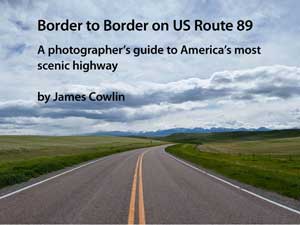
Border to Border on US Route 89
James Cowlin

US-89-Photography-Guide-CoverWhen I first glanced at the title of James Cowlin’s latest ebook, I’m pretty sure I expected it to contain advice on exposure and filters and other photographic folderol. But a more thoughtful reading of the carefully constructed title yielded a different impression. Just as the title says, Border to Border on US Route 89; A photographer’s guide to America’s most scenic highway is not a guide to photography. It’s a guide to a highway.

It was written by a very accomplished photographer and other photographers, even some as good as Cowlin himself, can benefit from it. But, at its heart, the book is simply a guide to Cowlin’s beloved US 89 written — and illustrated — from a photographer’s point of view.

The book is organized around thirty photos taken in the spring of 2010 as the Cowlinses (Jim and wife Barbara) traveled the highway from Mexico to Canada. Each beautiful photograph is accompanied by a few lines of text which typically tell something about the subject as well as something about the photo. But that something about the photo is not F stops and focal lengths. It’s generally just Jim explaining what he saw and tried to capture.

The photos appear, each on its own page, in south to north sequence. Cowlin sees three geographic regions along the route and a couple of pages of description precede the photos from each region. These pages provide a little background, give some idea of what might be seen there, from the 58 kinds of reptiles and amphibians in southern Arizona to the glaciers at the Canadian border, and identify some favorite photo ops.

The book does not contain detailed instructions for driving the route or for duplicating the wonderful pictures. It does contain an excellent overview of the road that Cowlin calls “America’s most scenic Highway”. He lets slip the real purpose of the book in the forward when he says “I do hope that this guide will inspire you to take a road trip on US Route 89.” The book definitely contains a lot of inspiration.

James Cowlin is the founder of US Route 89 Appreciation Society. Border to Border on US Route 89; A photographer’s guide to America’s most scenic highway can be purchased here. A Road Trip Map Book is available here.


Deciding that book reviews were a good fit for this blog instantly put me way behind. If I posted them on Sundays when there was nothing more pressing it might take me months just to squeeze out the half-dozen or so already on the list. To keep that from happening, I’m going to post book reviews on Wednesdays for the next few weeks and leave Sundays for whatever.

My Gear – Chapter 1
Agfa ePhoto 780c

Agfa ePhoto 780c cameraThere has always been some hardware associated with my road trips. In order to update a website, I needed some sort of computer and, if I intended to include photos in those updates, I needed a digital camera. GPS has also been part of the mix from the beginning. A computer, a camera, and a GPS receiver have been my travel companions on every trip but they have changed at least as much as I have though in different directions. While I’ve gotten weaker and slower and balder, they’ve become more powerful, faster, and more loaded with features.

Noticing changes in electronic gear occurs fairly frequently. It’s unavoidable when something new enters my toolkit but I also think of it at random times like when I upload a decent sized picture in less time than it used to take to upload the tiniest of thumbnails. I thought about it in some detail in August of 2009. It had been exactly ten years since my first road trip post and I was on another one. I commemorated the first trip by posting a picture and some musings on each day’s tenth anniversary. I think the idea for something like this series of articles was born then though I didn’t quite realize it and I had no idea of the form it would take. The “series of articles” I’m talking about will be a set of blog posts talking about the various bits of gear I’ve used in maintaining DennyGibson.com. This is the first. Others will appear, in sequence but not consecutively, as space and time permit.

Arcadia, OK, Round Barn 1999In July of 1999, I bought an Agfa ePhoto 780c from on online outfit called uBid for $185.99. What I got for that nearly two hundred dollars was a zone focus 350 kilopixel (Does that sound better than 0.35 megapixel?) camera that stored JPGs on an included 2 MB Smart Media card. The standard resolution was 320×240 but it also offered 640×480 and 1024×768. That last resolution was produced by extrapolating those 350 kilo-pixels into 0.786 mega-pixels and I’ve always assumed that is where the model number came from but don’t really know. Click on the picture above for one of those full resolution photos from 1999.

I also carried a Nikon 35mm pocket camera for “real” pictures but the Agfa did the job it was hired for giving me a way to post pictures on the same day they were taken. Back in the twentieth century that seemed pretty cool .

The camera came with Agfa’s Photowise software which allowed me to copy photos from the camera and edit them on my Toshiba Libretto (the subject of a future post). The interface was RS-232 serial and none too fast. I soon developed the habit of immediately firing up the copying when I checked into a motel then heading out to dinner while the photos flowed through the wire. On my return, I’d select and edit the photos, prepare the web page, and start the upload — assuming I could actually connect with my 10¢ a minute dial-up.


The journal of that first trip is here. It is the only trip where I truly relied on the Agfa. The ten year reminiscences begin here. Look to the right side of the page.