
 I really don’t like writing things that make others look bad and no one likes writing things that make themselves look foolish. Today I’m doing both.
For over six years, my website has been hosted by an outfit called Arvixe. It has served me well, and even today is mostly satisfactory. I moved the site this week for just one reason and my decision had much more to do with their handling of the problem than the problem itself. That’s where the anger comes from. The embarrassment comes from the fact that I put up with the problem for more than a year.
There are email lists associated with both this blog and the trip journal part of the website. In July of 2019, I noticed that some messages were bouncing. I believe the bouncing must have started sometime in June. Of course, there’s some embarrassment in the fact that I wasn’t paying closer attention and didn’t spot it sooner, but I do have an excuse. I was in the middle of a road trip which means I was often running out of time to maintain the journal let alone keep an eye on things that are supposed to just work. When the trip ended and I was back home, I looked into it a bit more and submitted a support ticket on July 10, 2019.
I’d encountered similar problems in the past and wasn’t overly concerned. This whole web thing is a hobby for me and I use what is called Shared Hosting to keep costs to a tolerable level. Dedicated servers and dedicated IP addresses offer increased control and performance but they are much more costly. Almost all hobbyists and many small businesses use Shared Hosting where many different websites share a server and an IP address. An obvious risk in this sort of arrangement is that bad guys might be among those sharing your server. Individual subscribers can’t do much about bad guys. Hosting companies try to keep bad guys out but screening can’t be perfect. So my problem started with some bad guys, spammers to be specific, moving into my cyber neighborhood.
Sadly, that is all too common. Sometimes the hosting company recognizes the problem quickly and boots the bad guys before they cause too much trouble. Sometimes they don’t, and people on the receiving end take action to protect themselves or their subscribers. This typically consists of putting the offending IP on a blacklist and rejecting all messages coming from there. I have had that happen multiple times with multiple hosting companies.
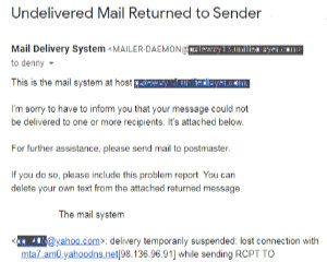 It’s terribly inconvenient, of course, but is usually solvable in a reasonable amount of time. Many blacklists are public with established procedures for getting off of them after proving the bad guy is gone. That’s not the case with Yahoo. Nor is it now the case with AOL and Verizon since, through purchases and mergers, they’re all one happy and secretive family. Their lists are essentially private and getting removed from them (i.e., restoring your reputation) is not very easy. I’m sure that knowing that made me more tolerant as weeks then months slid by with no resolution.
My tolerance for a lack of action was due partly to a lack of travel. The blog’s email list runs at least once a week but currently contains just two Yahoo addresses and one AOL address. The travel journal’s list runs daily but only when I’m on the road. It contains nearly twenty of the at-risk addresses. After that July trip, an August trip was pushed into September then canceled. With a maximum of three messages getting bounced (and very occasionally none), I convinced myself I could wait. When short trips in October and December brought a rash of rejection notices, I convinced myself I didn’t have time to undertake moving the site right then. My dumbest move in this whole fiasco came at the end of the year when, stuck on the idea that I had no time to move the site, I renewed my agreement with Arvixe and actually gave them more money! Then came COVID. Trips that were planned for April, June, July, and August were canceled. That should have left me with time to move the site, but now I had another stupid excuse. I’d just renewed my hosting plan and had to protect my investment.
The summer passed with varying amounts of bouncing each week. I entertained myself by reporting the continuing lack of progress on the support ticket with increasing levels of sarcasm. I made a point of noting the problem’s one year anniversary. For their part, the Arvixe support techs repeatedly explained how tough the problem was, avowed it was a high priority involving the most senior admins, told me about their complex email system (CloudMark), and reassured me that they understood how important the issue was to me and that my patience was sincerely appreciated. They also frequently asked me to supply headers from the reject notices although I’m reasonably certain that was purely to give the impression of something being done. It became apparent that the CloudMark system, which sounded like something that should avoid unreliable IPs, either didn’t work or was administered improperly. In fact, rather than being used to solve the problem, its complexity was used as an excuse for the lack of progress. It was also obvious that either those senior admins were incapable of having an IP removed from a blacklist despite months of effort or they had succeeded in getting IPs removed but that bad guys kept being allowed on the server and causing the IPs to be placed right back on the blacklist. Neither described a company deserving of my business.
I eventually managed a short trip in September and the resulting rash of rejection messages from the journal’s email list finally convinced me I had to do something. Two days after that trip ended, I arranged for hosting at another provider. I let Arvixe know, in my next ticket update, that I intended to move around the middle of the next month, but no one there acknowledged it. And nothing improved.
 Over the next couple of weeks, I moved things to Bluehost, my new hosting provider. Last Monday, I activated access to the new location (i.e., switched name servers) but encountered some problems and backtracked. On Tuesday, with help, via chat, from Bluehost technicians, the switch was made successfully. This is my first blog post since the move, and I’m really looking forward to it reaching all subscribers. I’m also looking forward to all subscribers to the trip journal list receiving mailings from an outing beginning early next month, and I sincerely apologize for taking so long to acknowledge and correct an intolerable situation. Email subscribers, this move’s for you. I very much appreciate each of you.
ADDENDUM 25-Oct-2020 09:45: At the time this was published, a problem existed which reported proper email addresses as invalid when attempting to subscribe. That has now been corrected.

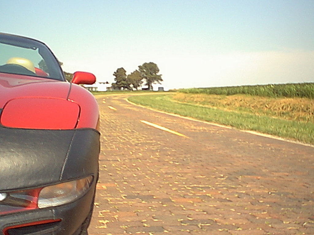
 A lot of things about the site have changed over the years but some things begun with that first trip have stuck. The concept of a page for each day with access to the next and previous day has been in place since the beginning as has a cover page with direct access to individual days. The idea of using the daily “Next’ and “Prev” button to (usually) represent the vehicle being used also goes back to that first trip. An animated GIF showing progress has been used on a few subsequent trips but it requires knowing the full route in advance and that’s often not the case. Besides, it’s a fair amount of work.
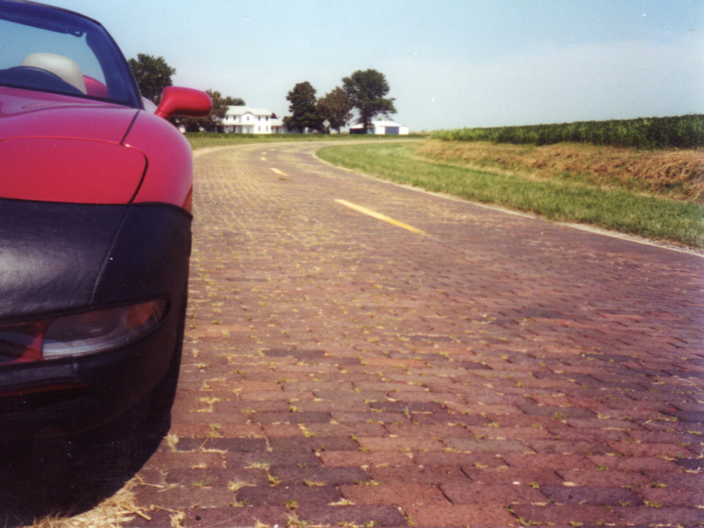
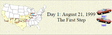
 The final cover page for that trip talks about it being temporary. As I said at the time, I expected it to go away because “I’ll need the space or retiring it will just seem right.” Web space became increasingly cheap and apparently retiring it never seemed right. Two decades later that first trip journal is still online and I’ve added 155 more. There is a
 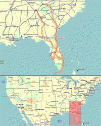 Although a locator map wasn’t initially part of a trip journal, I did start doing it fairly early on then retrofitted one to journals already posted. A small button shaped like the contiguous US accesses the maps. For multi-day trips, the button is at the top of the cover page next to the trip title. For single day trips, it’s next to the trip title on the only page there is. The general model is a map of the route “zoomed” to fill the available space sitting atop a map of the US with a red rectangle marking the area involved.
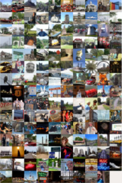
 For something that did not even register on my radar a month ago, the concept of mobile-friendly websites has grabbed a lot of space on this blog in the young 2016. The first post of the new year led to me realizing that mobile devices should not simply be ignored. The second post discussed a little of what I had learned and described the first steps taken to be mobile-friendly. And this, the fourth post of the new year, is a report on reaching a milestone on the road to mobile friendliness.
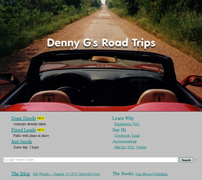
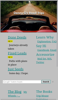 The milestone I speak of is having a home page that passes both Google and Bing mobile friendliness tests. That’s it at the top of the article in desktop (actually laptop) view and at the left in smartphone view. It is the biggest change to the website’s front door in at least fifteen years. It retains most of the flavor and function of the previous version but is simpler and scales down a lot better. About the only things missing are the RSS feeds from Route 66 News, Roadside America, and American Road Magazine and the randomly selected road trip photo and link at the page’s upper right. Both came with a lot of overhead and I don’t recall anyone ever complimenting me on either. I personally really liked the random picture thing, however, and have kept it alive with a “Done Deeds”-“All Trips”-“Random” menu item. The Google ads also seem to be fairly high in overhead and, although I’m hanging on to them for the present, I will be keeping an eye on them and they could go missing.
 There are a few pages that may never be truly mobile-friendly as Google and Bing see things. Among these are both Oddment and Road Trip index pages. While changes have been made to make text on the pages readable on mobile devices, the table displays overflow smartphone screens in all directions and require zooming and/or panning to view. There are schemes, using pop-ups and such, to make tables slimmer and more mobile-friendly. I don’t really like any I’ve seen and am firmly of the belief that the conversion effort would not be justified for either of these tables. While they might not be officially mobile-friendly, and I have no quibbles with either Google’s or Bing’s criteria, they seem quite usable on my smartphone and I don’t consider them overly unfriendly.
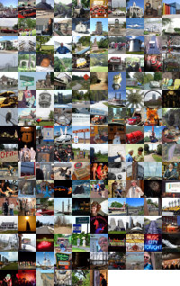
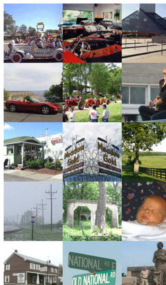 The Clickable Collage is another page which is not officially mobile-friendly. Containing a single photo from every completed road trip, it allows the individual photos to be clicked to access the journal for the associated trip. It was formerly available through a link below the randomly selected photo at the home page’s upper right. It is now reached through the “Done Deeds”-“All Trips”-“Collage” menu item. Although I don’t expect everyone to experience the same memory stimulation I do when viewing the collage, I have to believe that it is most impactful when seen in its entirety. Of course this is best done on a full size (whatever that is) screen where the total view is also actually usable. Making this collage fit a small screen by forcing it into one or two very tall columns just seems wrong and more irritating than impressive. It is clearly not a natural fit for smartphone screens but it can, like those index pages, be viewed and used by panning. It can also be zoomed to fit but, while this view of
  I didn’t do it on purpose, Jim. Honest I didn’t. But, as has happened a time or two in the past, mentioning a problem in a blog post was enough to get some insight from blogger
 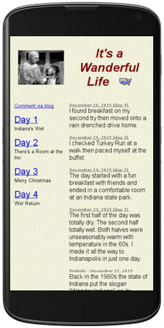 I revisited the Google testing tools and paid a lot more attention to the suggestions. There was some good news. The vast majority of my website is very simple so that adding just one line (to set a mobile viewport) to a page allows it to pass Google’s mobile-friendly test and makes it look better. The page shown at the top of the article reappears at the left with that one line added.
 Nobody sees the trouble I’ve known. Maybe not nobody, exactly, but not many. There are two primary RSS feeds published by this site. One is for this blog. The other is for the trip journal. Among the many ways of subscribing to these feeds is a service called
 I am a fan of RSS. I subscribe to a number of feeds and I publish a few. I even know what the acronym stands for. Maybe. Unfortunately, the words behind the letters have changed over the years so that discussing the acronym is more involved than discussing either the concept or its application. If you already know — or don’t care — about RSS, feel free to skip to the sentence in bold. If you want to know even more than I am about to tell, go


 In
In  Like its big brother, FrontPage Express was a WYSIWYG (What You See Is What You Get) editor that allowed you to lay out a web page and position various elements on it without knowing HTML (Hyper Text Markup Language). It differed from full blown FrontPage in the type and number of elements supported and some other capabilities which, for the most part, were beyond me anyway. As with most editors of this sort, it also allowed access to the HTML behind the page.
 PhotoWise seemed to be exactly the program I needed to prepare pictures for the web. I could crop, resize, and rotate and there were adjustments for many image attributes including color and hue and saturation. About the only things I ever played with were contrast and brightness. Apparently I decided to post 512×384 pixel pictures for that first trip. That was half the resolution of the Agfa camera which meant I could trim away a fair amount of garbage if necessary. Pictures could be saved in four different quality levels. I used Medium (which was probably better than the pictures deserved) rather than High for smaller files. Once the full size picture was ready, I did some more cropping and shrinking to make thumbnails.
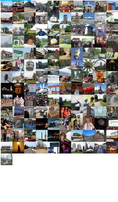