 Laurel Kane has been gone nearly three months. The Route 66 icon and personal friend died on January 28, 2016. In the days that followed, many of her friends and associates shared memories on Facebook, on their own blogs and websites, and in various comment threads and other locations around the web. For a hodgepodge of reasons, not all of which even I understood, I didn’t. It certainly wasn’t because of a lack of memories. There were plenty of those swirling through my mind as January came to an end but I made no effort to capture them. I just let them swirl.
There was no funeral gathering or big memorial service at the time of Laurel’s passing. Several members of the Route 66 community, in the area for another event, are gathering in Afton today to share memories. Her family is hosting a Celebration of the Life of Laurel Kane at her beloved Afton Station next Saturday which I will attending. This seems the right time for this post.
I knew Laurel for slightly more than a dozen years. Our first face-to-face meeting was in September 2003; Our last in May 2015. Phone calls, email exchanges, and other communication occurred both before our first and after our last physical meeting. Our most recent email exchange took place a few days before Christmas.
That initial meeting was at the Route 66 Festival in Springfield, Illinois, which I believe was the farthest from Afton Station I ever personally saw her. I had already driven Route 66 end-to-end twice before I learned about things like festivals. I learned of that one too late to get in on the awards banquet but did manage to snag a spot at the eGroup breakfast. (For any that don’t know, a Route 66 Yahoo group often gets together for breakfast during major Route 66 gatherings.) I knew only a few names and almost no faces and probably looked pretty much lost. Laurel invited me to sit with her and her daughter and I was lost no more. Of course, I soon learned that making people feel welcome was just one of Laurel’s talents.
We met several more time over the years. All were in either Tulsa or Afton with the exception of our last meeting in May when I was attending the Jefferson Highway Conference in Muskogee. Juggling Laurel’s always busy schedule and that of the conference, she and Ron McCoy met me for linner (Laurel’s name for a meal between lunch and dinner) in Pryor about halfway between Afton and Muskogee. Laurel insisted on getting together despite it interfering with watching her beloved Kentucky Derby.
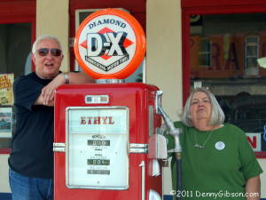 The picture of Laurel with Ron and Ethyl is from a 2011 stop at Afton Station. Not only do I miss seeing her at the station, I miss, as do so many others, reading her blog. It may have been created to promote the station but Thoughts from a Route 66 Business Owner might involve just about anything going on in any part of Laurel’s world. It was sometimes informative, sometimes insightful or entertaining, and always interesting.
I also miss Laurel as a reader. I miss her in ways that not everyone will. Laurel was one of a small group of people who subscribed to both my trip journals and my blog. She was actually part of the smaller group who read them with anything approaching regularity. I know Laurel did not read every word or look at every picture but she read and looked more than most. And she occasionally interacted with a comment or an email which made her part of an even smaller group. Laurel had visited every state in the union and had lived in several. Her response to a journal post often concerned something she remembered about where ever I was from her own time there. A semi-recent one was my January 2015 visit to Florida. When she saw I would be near a place where she once had a condo she dropped me a note. I was able to give her a little update and benefit from her restaurant suggestion.
The Cliff House in San Francisco was a completely different story. The historic restaurant is something of a symbolic end to the Lincoln Highway. Despite never having been there, Laurel had assembled a large collection of Cliff House memorabilia and got a little kick from the few times a road trip took me there.
Laurel also read my printed words and read them before almost anyone else. Like this website, the two books I have self published are more bucket list and hobby than a serious attempt at a new career. Laurel agreed to help me out by proofreading both books and both were considerably improved by her efforts. Although she had the knowledge and skill to be a grammar Nazi, Laurel was pretty much the opposite. Most of her corrections seemed like friendly suggestions and that’s essentially what they were. Laurel was never upset or even slightly offended on the rare occasion I chose not to follow a suggestion. She sometimes even encouraged a little rule breaking like when she followed tagging an incomplete sentence with “…but I like incomplete sentences.”
I had nothing to do with the creation of the photo at the top of this post. I stole it from Laurel’s Facebook page where she posted it as a profile picture back in 2011. Though unintentional, I did have something to do with that. Facebook friends of mine probably know of my habit of changing my profile picture to a similar one from my childhood when I set out on a road trip. When I did that for an August 2011 trip I added the description “Looking for a triker bar”. That’s when Laurel changed her profile photo to the one from her own childhood and asked, “Can I go to the triker bar with you?” We never made it to a triker bar but we did make it to Clanton’s and Tally’s and a few other places including the “Center of the Universe“. Every one of those many memories brings a smile.
Although they don’t all come from actual meetings, a search for “Laurel Kane” at DennyGibson.com returns a couple dozen references for anyone curious about other memories.
 I’m sorry. I am a punster. I make puns on a regular basic. If you’re the sort of person who believes that good puns do exist, you would likely call them bad puns. Others think the phrase “bad puns” is simply redundant. Sometimes I try to defend my puns and sometimes I just ignore the groans as if the pun was entirely accidental. Sometimes I apologize.
 Tim Goshorn has been gone just over a week. He died of cancer last Saturday. During that week, photos and memories from friends, fans, family, and other musicians have filled the internet. The few photos I have don’t begin to compare with the many great ones I’ve seen and my memories don’t go back as far or go nearly as deep as many. But I do have memories. Lots of them. All good. Most with tapping toes and a big grin.
 The trip count was down a little but one of them was a duesy. My 41 day 11,000 mile trip to Alaska broke all previous time and distance records and pretty much accounted for the jump in total days on the road all by itself. Pictures posted increased accordingly and posted road trip pictures topped 2000 for the first time. I did not break the 1000/trip mark however. My count for Alaska trip pics is 999. In addition to the 52 regular weekly blog posts, there were 8 reviews, 7 road trip links, and 2 miscellaneous asynchronous posts. After having three of 2015’s new blog posts among the year’s five most popular, this year saw no new posts in the top five but it was close. The most visited post in 2016 missed being published in 2016 by twenty-six days. I’ve no choice but to consider that close enough and declare it the top new post. On the other hand, after two years with none, a pair of newly minted entries appear in the the non-blog top five.
 We fought a war to get this country going then gave every land owning white male above the age of twenty-one the right to vote. A little more than four score years later, we fought a war with ourselves that cleared the way for non-whites to vote. Several decades of loud, disruptive, and sometimes dangerous behavior brought the granting of that same right to non-males a half-century later and another half century saw the voting age lowered to eighteen after a decade or so of protests and demonstrations.
 Of course, putting something in a constitution does not automatically make it a practice throughout the land and I am painfully aware that resistance followed each of those changes and that efforts to make voting extremely difficult for “the other side” are ongoing today. I don’t want to ignore partisan obstructions and system flaws but neither do I want to get hung up on them. I meant my first paragraph to be a reminder that a hell of a lot of effort, property, and lives have gone into providing an opportunity to vote to a hell of a lot of people. Far too many of those opportunities go unused.
 In the title I claim to not care how anyone votes. That’s not entirely true, of course. I have my favorite candidates and issues. I’ll be disappointed in anyone who votes differently than I do but not nearly as disappointed as I’ll be in anyone who doesn’t vote at all. I’m reminded of parents working on getting their kids to clean their plates with lines like, “There are hungry children in China who would love to have your green beans.” I’m not sure what the demand for leftover beans is in Beijing these days but I’m pretty sure some folks there would like to have our access to ballots and voting booths.
 I’m talking about travel advice and I’m really talking about one particular website. It’s a site,
  It really was the realization that I had used TripAdvisor so regularly on the Alaska trip that made me think of doing a post to thank and praise them but it is also a chance to talk about my part in the crowd that’s doing the sourcing. I don’t know when I first used TripAdvisor but I know it was well before I submitted my first review in August, 2008. I obviously warmed to it slowly and submitted just one review per year in 2008, 2009, and 2010. The gates finally opened with a western Lincoln Highway trip but I think it was a couple of trips later and a desire to boost a mom & pop motel in Michigan that got me to thinking differently and belatedly post several reviews from the Lincoln Highway outing.

 Some might remember 2014’s

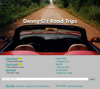 For something that did not even register on my radar a month ago, the concept of mobile-friendly websites has grabbed a lot of space on this blog in the young 2016. The first post of the new year led to me realizing that mobile devices should not simply be ignored. The second post discussed a little of what I had learned and described the first steps taken to be mobile-friendly. And this, the fourth post of the new year, is a report on reaching a milestone on the road to mobile friendliness.
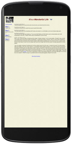
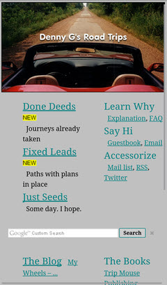 The milestone I speak of is having a home page that passes both Google and Bing mobile friendliness tests. That’s it at the top of the article in desktop (actually laptop) view and at the left in smartphone view. It is the biggest change to the website’s front door in at least fifteen years. It retains most of the flavor and function of the previous version but is simpler and scales down a lot better. About the only things missing are the RSS feeds from Route 66 News, Roadside America, and American Road Magazine and the randomly selected road trip photo and link at the page’s upper right. Both came with a lot of overhead and I don’t recall anyone ever complimenting me on either. I personally really liked the random picture thing, however, and have kept it alive with a “Done Deeds”-“All Trips”-“Random” menu item. The Google ads also seem to be fairly high in overhead and, although I’m hanging on to them for the present, I will be keeping an eye on them and they could go missing.
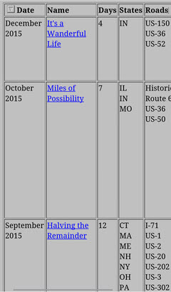 There are a few pages that may never be truly mobile-friendly as Google and Bing see things. Among these are both Oddment and Road Trip index pages. While changes have been made to make text on the pages readable on mobile devices, the table displays overflow smartphone screens in all directions and require zooming and/or panning to view. There are schemes, using pop-ups and such, to make tables slimmer and more mobile-friendly. I don’t really like any I’ve seen and am firmly of the belief that the conversion effort would not be justified for either of these tables. While they might not be officially mobile-friendly, and I have no quibbles with either Google’s or Bing’s criteria, they seem quite usable on my smartphone and I don’t consider them overly unfriendly.
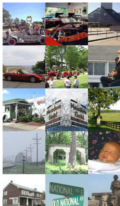 The Clickable Collage is another page which is not officially mobile-friendly. Containing a single photo from every completed road trip, it allows the individual photos to be clicked to access the journal for the associated trip. It was formerly available through a link below the randomly selected photo at the home page’s upper right. It is now reached through the “Done Deeds”-“All Trips”-“Collage” menu item. Although I don’t expect everyone to experience the same memory stimulation I do when viewing the collage, I have to believe that it is most impactful when seen in its entirety. Of course this is best done on a full size (whatever that is) screen where the total view is also actually usable. Making this collage fit a small screen by forcing it into one or two very tall columns just seems wrong and more irritating than impressive. It is clearly not a natural fit for smartphone screens but it can, like those index pages, be viewed and used by panning. It can also be zoomed to fit but, while this view of
  I didn’t do it on purpose, Jim. Honest I didn’t. But, as has happened a time or two in the past, mentioning a problem in a blog post was enough to get some insight from blogger
 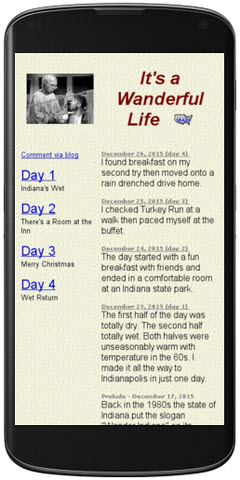 I revisited the Google testing tools and paid a lot more attention to the suggestions. There was some good news. The vast majority of my website is very simple so that adding just one line (to set a mobile viewport) to a page allows it to pass Google’s mobile-friendly test and makes it look better. The page shown at the top of the article reappears at the left with that one line added.
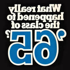 I made a couple more trips this year than last but they were shorter and resulted in less total days on the road. That naturally caused a slight drop in pictures posted to the journal but pictures in the blog increased so that there was not a significant change in the total number of new pictures. In addition to the 52 regular weekly blog posts, there were 14 reviews, 9 road trip links, and 2 miscellaneous asynchronous posts which adds up to just three less blog posts than last year. Three of the new blog posts generated enough traffic to make the top five. The most popular new blog post concerned a little ol’ high school reunion. Once again there were no new posts in the non-blog top five.
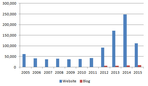 So what’s that mean? One possibility is that a change in the way statistics are compiled or visits detected resulted in an artificial drop in the numbers and I can produce some arguments both for and against that theory. The “for” ones are the weakest. What seems more likely and less palatable is that the numbers don’t lie and readership has truly plummeted. Jim Grey, a friend and popular blogger, recently posted an article he called