
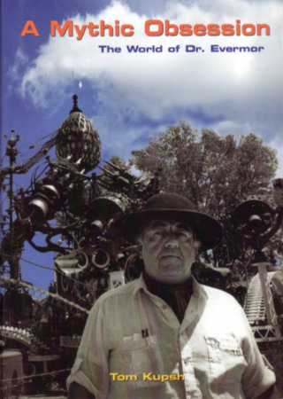
 Sometimes I astound my friends with my knowledge, admittedly quite useless, of unusual and obscure roadside attractions. Othertimes I astound myself with my complete ignorance of a major and fairly well-known piece of public art. A stop on a recent Society for Commercial Archeology bus tour was an occasion of the latter sort. I imagine readers of this review will have thoughts that are similarly divided. Some will wonder just what is that pile of junk and why would anyone put it on the cover of a book. Others will smile with instant and delighted recognition. Ah yes, the Forevertron.
From one perspective, the Forevertron is a 65-foot tall sculpture made of various bits of scrap metal. From another, it is a fantastic device waiting to propel Dr. Evermor “up to the celestial spheres.” From a third, it is a marvelous project that helped Tom Every deal with the real world. Tom Kupsh covers all three of these perspectives in A Mythic Obsession.
The book contains something of a Tom Every biography. It describes his early attraction to unwanted stuff and what seems to be a natural talent for getting some good out of what other people throw away. It tells about his ups and downs in salvage and professional scavenging and his long-time involvement with Alex Jordan and his House on the Rock. His relationship with Eleanor Gryttenholm, a.k.a., Lady Eleanor, that continues today, having survived both marriage and divorce, is in there too. It’s a life that Kupsh describes as rocky but never dull.
It is Every’s artwork, however, that attracts all the attention and warrants a book. Much of it is big, like the Forevertron, but he has also produced some rather small pieces. The common attributes are whimsey, creativity, and scrap metal. Kupsh describes most if not all of Every’s major works. His descriptions usually include information about when and how the piece was made and sometimes even why. He often tells what the components actually are and where they came from. This is very much the case with the Forevertron and that is something I very much appreciated. The book and the sculptures are a natural pair. At times, while reading the book, I found myself wishing I had read it before visiting the collection so I would have been aware of various details about what I was seeing. On the other hand, I’m kind of glad I had my first look with few preconceptions. I’m thinking that neither sequence is wrong and that whether you start with reading or visiting, you’re going to have to repeat. Seeing the sculptures will raise questions that only the book will answer and the book will fuel curiosity that only a visit will satisfy. I intend to return with book in hand.
The biographical bits are aided by several pictures and there are pictures included of the various pieces of art described. Most are black and white but there is a section of really nice color photos that includes an annotated view of the Forevertron. You can bet on me having that page bookmarked when I next head to Wisconsin.
A Mythic Obsession, Tom Kupsh, Chicago Review Press, June 1, 2008, 6 x 9 inches, 196 pages, ISBN 978-1556527609
Available through Amazon.
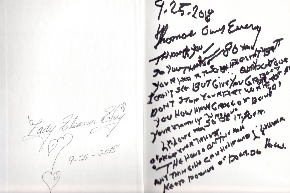 I purchased my book onsite from Lady Eleanor. Tom is in a nursing home and rarely gets to the Forevertron these days. Both had inscribed the copies available about nine months previous. I selected one with a fairly lengthy message from Tom even though that message wasn’t quite clear to me at the time. I figured it would become readable when I was sitting still in good lighting. It hasn’t. Among the few phrases I can make out are “80 years” (His 80th birthday was five days earlier.), “I can’t see”, “don’t stop your art”, and “The House on the Rock”. All help from those with better eyesight or insight is appreciated.
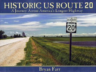 This book didn’t put US-20 on my to‑drive list, that happened long ago, but it did move it up quite a bit. At 3365 miles, Route 20 is currently the longest of the U.S. Numbered Highways so it’s quite naturally a road I’ve thought about driving. I have driven bits of it, of course, and crossed over it many times. It would be pretty hard to completely avoid a road that crosses the entire country as this one does. In Historic US Route 20: A Journey Across America’s Longest Highway, Bryan Farr documents an east to west drive over the entire length of the highway and the entire breadth of the nation with a couple hundred great color photos. There is something I’d like to see in just about every one of those photos.
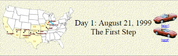 A lot of things about the site have changed over the years but some things begun with that first trip have stuck. The concept of a page for each day with access to the next and previous day has been in place since the beginning as has a cover page with direct access to individual days. The idea of using the daily “Next’ and “Prev” button to (usually) represent the vehicle being used also goes back to that first trip. An animated GIF showing progress has been used on a few subsequent trips but it requires knowing the full route in advance and that’s often not the case. Besides, it’s a fair amount of work.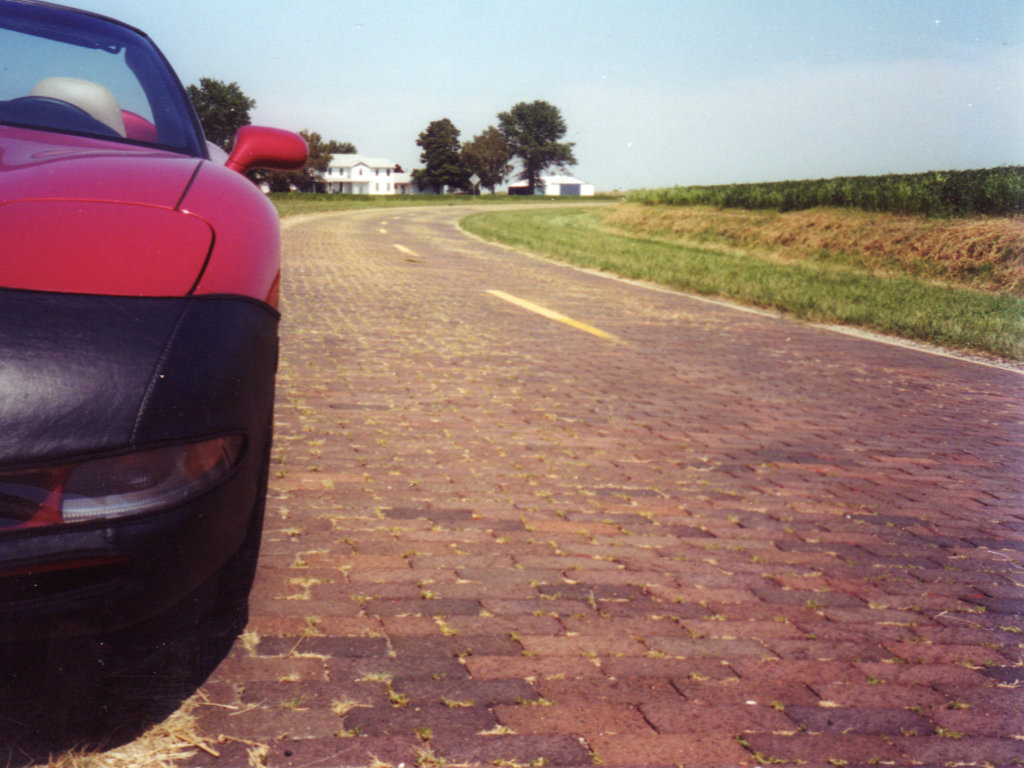
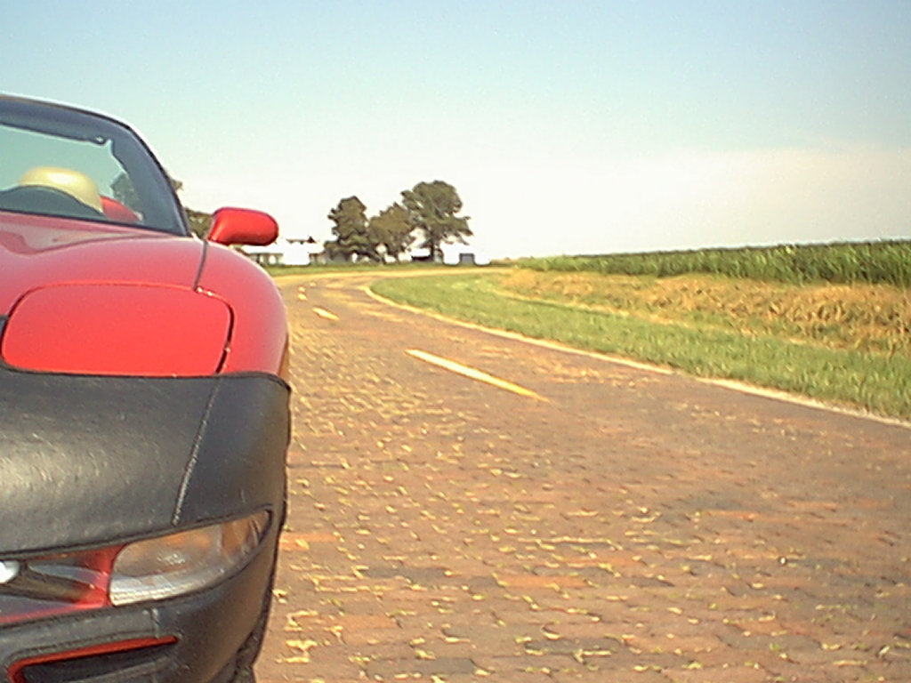
 The final cover page for that trip talks about it being temporary. As I said at the time, I expected it to go away because “I’ll need the space or retiring it will just seem right.” Web space became increasingly cheap and apparently retiring it never seemed right. Two decades later that first trip journal is still online and I’ve added 155 more. There is a
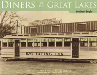 My original notion of what’s inside Diners of the Great Lakes was not very accurate, but I’m not the least bit disappointed. For no particular reason, I more or less expected this book to be something akin to a directory of diners currently existing in the Great Lakes region along with a telling of their individual histories. There is a certain amount of that, but it comes late in the book after Engle has delivered not just the history of diner operation in the region but of the manufacture of diners there along with their development as something distinct from what occurred nearer the Atlantic.
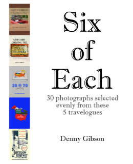 And now for something completely different. Anyone who thought releasing two books within three months might be overdoing it will have no doubts about that being the case when they see another appear a week later. But this is a different kettle of fish. Really. Six of Each is a collection of photographs drawn from the previously published travelogues. Each of those travelogues is available in two forms. There is a black-and-white printed version and a color digital version. Photo-quality color printing is still relatively expensive in the low-volume print-on-demand world. Printing the books in black and white keeps them reasonably priced. On the other hand, color in digital files is free. Offering B&W paperbacks and color ebooks isn’t ideal but it keeps the books affordable and color at least available.
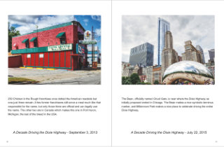 So what I’ve done is pick a half dozen pictures from each of the existing travelogues and combine them in a Blurb magazine. The magazine is only available through Blurb (that’s one of those magazine restrictions) and there is no digital version available (that’s my restriction). It’s also more expensive than it seems a 32-page “magazine” ought to be. But it does let me see what some of my photographs would look like using something besides black ink on stationary paper. And it’s there for anyone else who would like to look.
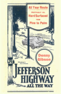 Too soon? What had been my most recent travelogue,
 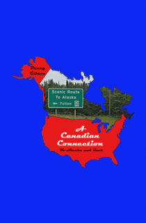 This is my fourth self published book; All are travelogues. This one is a midquel that covers the omitted middle section of a trip that formed part of the previous book,
  A funny thing happened on the way to this review. Not funny ha ha; Funny peculiar. This is Jim Grey’s second book. I reviewed the first, Exceptional Ordinary, in April, 2017. I figured that this review would reference that one, make some comparisons, make some jokes. It would be fun; Maybe even funny ha ha. But that review has gone missing. I don’t know how or even when. I’ve
  I photograph a fair number of signs as I travel, and I know quite a few people who photograph many more than I. Not one, however, is in the same league as Debra Jane Seltzer. If sign hunting was an Olympic sport, the petite Seltzer would be buried under gold medals. Her photo expeditions are legendary. Until recently, when she and her dogs (currently four) headed out in the white Chevy van named Sparkle, they would take along a big stack of notes and marked up map printouts. Today there might still be a printed list of targets but Google maps and a smartphone have reduced the need for paper considerably. The target list is never limited to signs. It’s almost certain to include interesting buildings and other roadside attractions of all sorts.
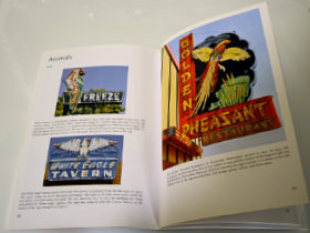 The “Animals” chapter is probably my favorite. Colorful birds, fish, and dogs draw customers to businesses of all sorts. Sequenced neon segments can make birds appear to fly and dogs and horses appear to run. A pig almost always indicates a BBQ restaurant although one sign shows a line of pigs merrily leaping in to a grinder to be made into sausage.
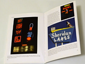 “Things” is as varied as you might imagine. Bowling balls and pins are popular as are skates, cars, and assorted food items. Donuts and ice cream cones seem to be the most common edibles used to attract customers. Bowling balls lend themselves to animation and when a neon bowling ball rolls, a strike is virtually guaranteed. Together, “Types of Signs” and the three chapters of the “theme” section make up a sort of sampler of the massive Roadside Architecture site. Picking less than 200 images to populate this sampler had to be tough but the choices made were excellent.